 Arc Design System
 Tooltip
Tooltips are user-triggered messages that provide additional information about a page element or feature. The information should be contextual, useful, and supplementary. They appear on hover or focus of an element.

Features
Keeps the interface clutter-free, while still providing contextual help.
#Import
import { Tooltip } from '@wpmedia/ads-tooltip'
interface TooltipProps
| Props | Description |
|---|---|
children | ReactElementThe component that will have tooltip enabled. |
contents(optional) | undefined | stringText in the tooltip. |
isDisabled(optional) | undefined | false | trueWhether the tooltip is disabled. |
position(optional) | undefined | "bottom" | "bottom left" | "bottom right" | "bottom start" | "bottom end" | "top" | "top left" | "top right" | "top start" | "top end" | "left" | "left top" | "left bottom" | "start" | "start top" | "start bottom" | "right" | "right top" | "right bottom" | "end" | "end top" | "end bottom"Placement for tooltip. |
#Component structure
The text label should be concise and limited to one or two sentences. There should be no more than two lines of text totaling 50-60 characters each for optimal legibility. Consider using a Dialog if the content exceeds two lines.
#Component positioning
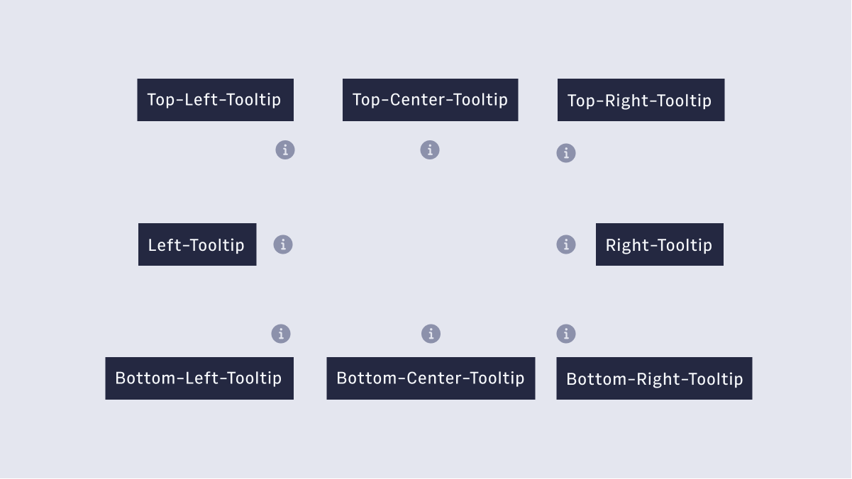 Tooltips may be positioned top, bottom, left, or right to the trigger element. The arrow of the tooltip may be aligned to left, center or right. Try and avoid obscuring contextual content.
#Usage
- Icons
- Text Links
- Images
- Buttons
#Accessibility
- Do not use tooltips for information vital to task completion. The elements they are attached to should usually make sense on their own, but a tooltip can help provide a little bit more information--especially for new users.
- Keep the content minimal, they are not intended to hide critical content.
- If you want interactive content, you can use a Dialog.
- WAI-ARIA Roles, States, and Properties The element that serves as the tooltip container has role tooltip.
- The element that triggers the tooltip references the tooltip element with aria-describedby.