 Arc Design System
 InlineAlert
An InlineAlert displays an inline important, succinct message, and provides an action for user to address or dismiss the InlineAlert).
🚧 Under construction
This component is under active development. If you need this component for your project, create an issue in the GitHub repo.
Features
Used for critical messages that require the user to address or dismiss.
Displays inline within the layout, and provides optional controls for dismissing.
An InlineAlert is a variation of the SnackBar and Alert component, with additional elements to compliment the inline nature. An inline alert displays information such as warnings, caution, and other important information to give users context on what is happening on their screen.
Inline alerts have the option to allow the users to dismiss or to stay persistent on the page depending on the designers intent for the alert.
It is recommended to not have more than two inline alerts on any given object. Anymore then two they are more likely to be ignored by the user.
Coming soon
Inline alerts should be displayed above the object that they are referencing. If they are referencing an entire page they should be above the content but below the navigation.
Inline alerts are able to be put on models, side panels, etc. The size of the inline alert will be full-width of the object that they are referring to.
Inline alerts can make use of the iconography and have color variations for more visual prominence if needed.
Inline alerts are similar in priority to alerts at medium urgency. Inline alerts communicate non-actionable and actionable information that requires awareness, but not always actions. They are moderately interruptive to the user experience so should be used only for information the user would be more disrupted by not knowing.
 The default status.
 For experiences that need an InlineAlert that relates to successful publishing.
 For experiences that need a success InlineAlert.
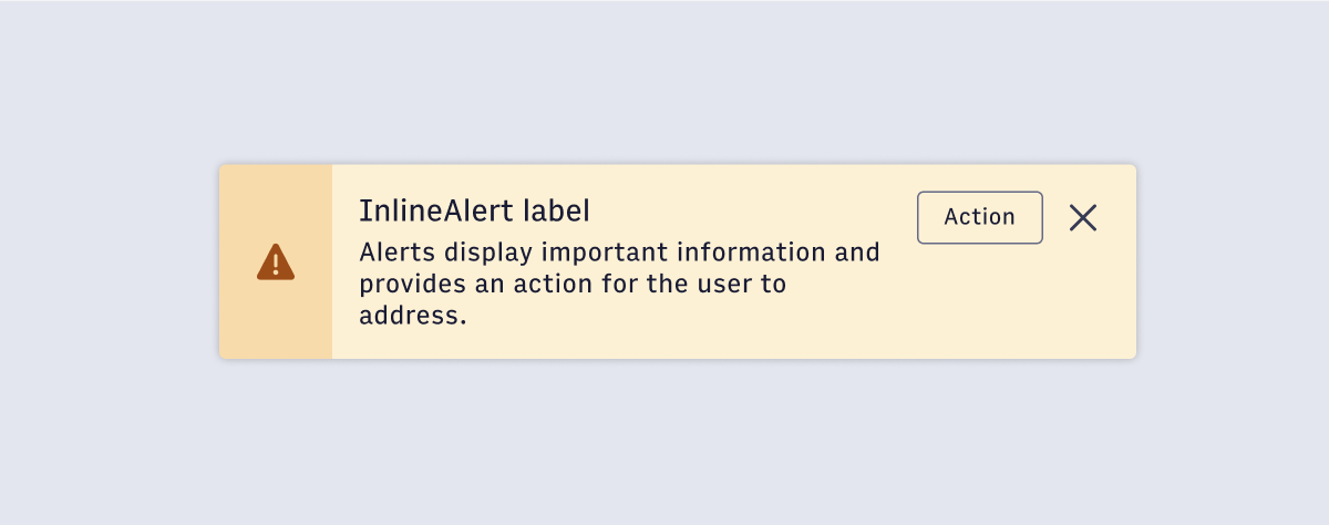 For experiences that need a warning InlineAlert.
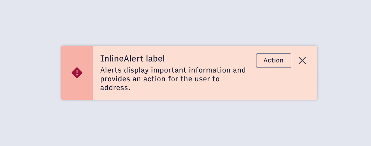 For experiences that need an error InlineAlert.
#Import
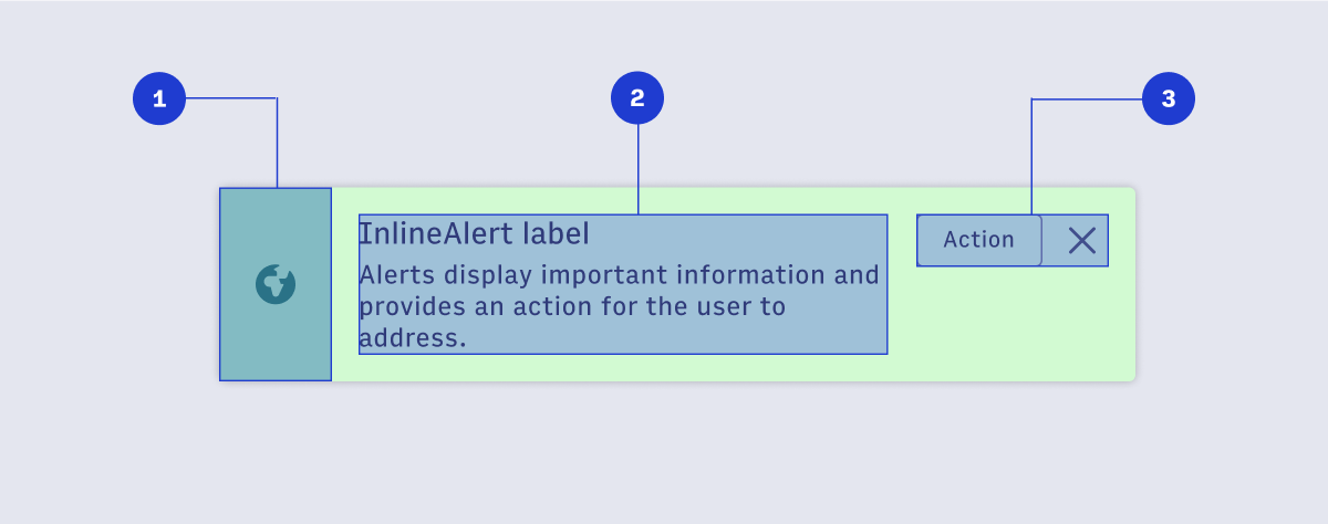
#Component Structure
- Status-level Indication (optional)
Icons should be used in combination with container color to communicate urgency and the type of alert. - Alert content
Titles should be short and concise to tell the user why the inline alert is being shown to them. Titles are optional. - Alert buttons (optional)
An outline button, and a dismiss button are optionally available.
#Usage
#Priority
#Status
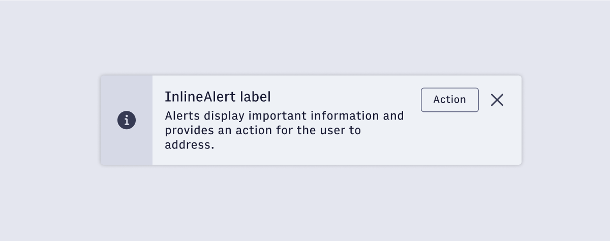
#Default
The default status.
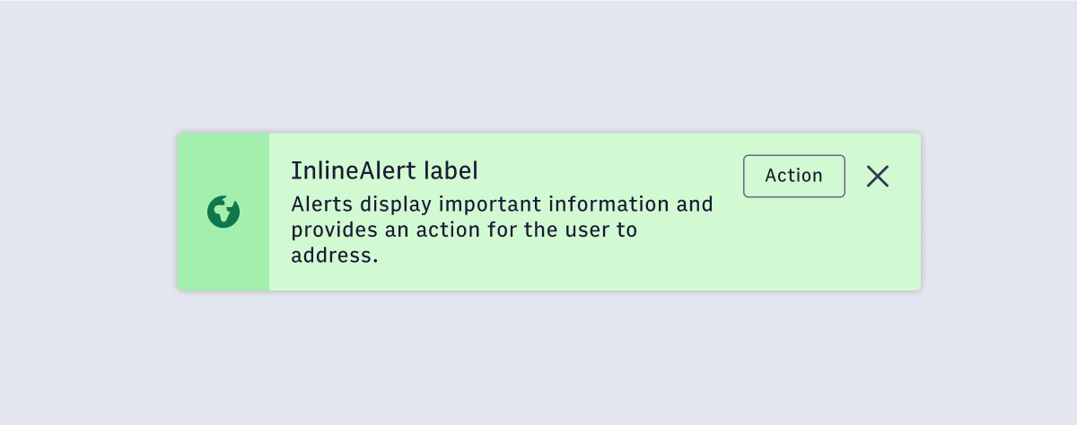
#Publish
For experiences that need an InlineAlert that relates to successful publishing.
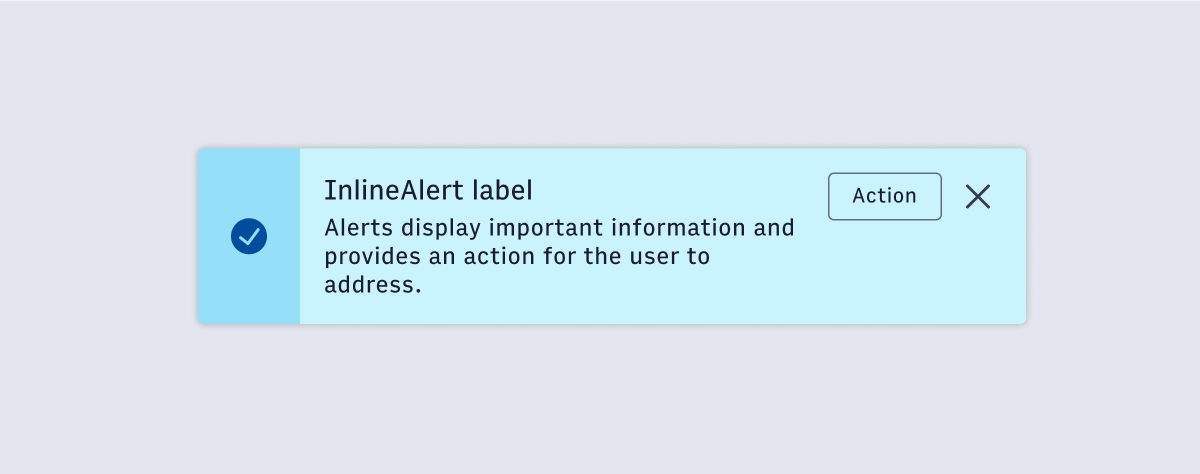
#Success
For experiences that need a success InlineAlert.
#Warning
For experiences that need a warning InlineAlert.
#Error
For experiences that need an error InlineAlert.