 Arc Design System
 Toggle
Toggles are a control that is used to quickly switch between two possible states. The user should see immediate feedback when interacting with a toggle.
🚧 Under construction
This component is under active development. If you need this component for your project, create an issue in the GitHub repo.
Features
Form component that can only be toggled off or on.
#Component structure
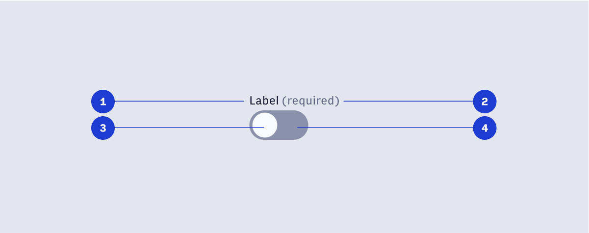
- Toggle label
- Required label
- Toggle knob: The draggable interface element to enable/disable the Toggle.
- Toggle track: The visual track the knob glides in.