 Arc Design System
 Dialog
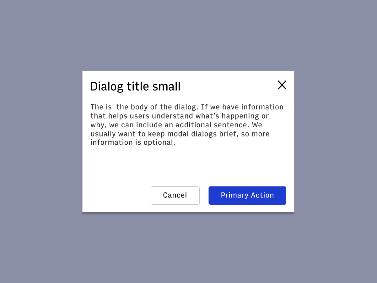
A Dialog is a conversation between the platform and the user. Dialogs often requests information or an action from the user. A dialog appears on top of the main interface typically in the form of a modal. A dialog disables the main content until the user explicitly interacts with the Dialog.
Features
Requests input from the user.
Appears on top of main content in the form of a modal.
Note
Before using the dialog, verify you aren't looking for theAlertDialog. Typically, the
alert dialog pattern forces the user to choose one of the provided
actions in order to close. The dialog can be closed by clicking outside
of the dialog, clicking the 'x', or pressing escape. For more
information on these patterns, see the WAI-ARIA
guides#Import
DialogDialogTitle- provides font styling for the headingDialogBody- container for non-title, non-footer contentDialogFooter- flex container for action buttons--there should be at least two buttons
import {
  Dialog,
  DialogTitle,
  DialogBody,
  DialogFooter,
} from '@wpmedia/ads-dialog'
interface DialogProps
| Props | Description |
|---|---|
children | anyDialog content |
isOpen | boolean = falseSpecifies if the dialog is open or closed |
onDismiss | anyFunction that closes the dialog |
size(optional) | "small" | "medium" | "large" = smallSpecifies one of three dialog sizes |
state | anyState Object (Open, Close) |
#Usage
#DialogBody and DialogTitle
Box component and take all the same props as Box
#Component structure
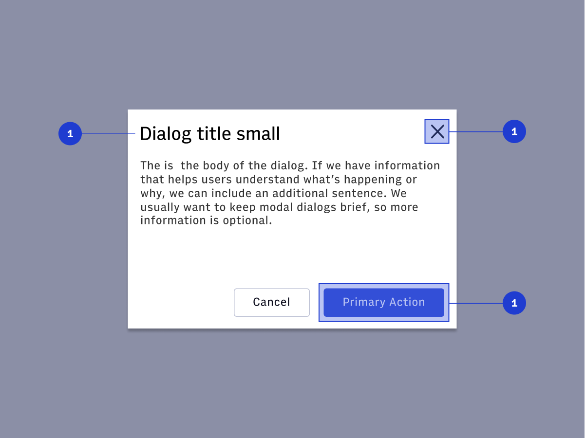
#1. Method to escape:
- Cancel Button (optional)
- Escape Key
- X Icon Button
#2. Descriptive title:
- Should contain a brief, clear statement or question
- Should use Title Case and prioritize keywords
#3. Primary action button:
- The primary action button should reflect the keywords in the dialog title. For example, dialog titled “Resolve Merge Conflicts” should have a primary action button titled “Resolve”
#4. Size:
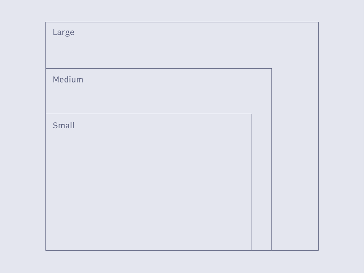
- Content inside the dialog should fit inside the container.
- If a scrollbar is needed, you may consider creating a new page instead
- Never use more than 50% of the screen for a modal dialog.
- Arc dialogs come in three sizes - small, medium and large. The size of the dialog depends on the content contained in the dialog.
#5. Overlay:
- Screen overlay that obscures the on page content.
#Usage
- show critical items or information that require immediate attention
- request the user to enter information required for continuing the current process
- fragment a complex workflow into simpler steps
#Accessibility
- Opening modal: The element which triggers the dialog must be keyboard accessible.
- Moving focus into the Dialog: Once the modal window is open, the keyboard focus needs to be moved to the top of the dialog
- Managing Keyboard Focus: Once the focus is moved inside the dialog, it should be “trapped” inside it until the dialog is closed.
- Closing the Dialog: Dialogs must be able to be closed via escape key.
#Keyboard interactions
tabindex value of zero or greater. Note that values greater than 0 are strongly discouraged.
- When a dialog opens, focus moves to an element inside the dialog. See notes below regarding initial focus placement.
- Tab: Moves focus to the next tabbable element inside the dialog. If focus is on the last tabbable element inside the dialog, moves focus to the first tabbable element inside the dialog.
- Shift + Tab: Moves focus to the previous tabbable element inside the dialog. If focus is on the first tabbable element inside the dialog, moves focus to the last tabbable element inside the dialog.
- Escape: Closes the dialog.
#Aria labels
- The element that contains all elements of the dialog, including the alert message and any dialog buttons, has role
alertdialog. - The element with role
alertdialoghas either: - A value for
aria-labelledbythat refers to the element containing the title of the dialog if the dialog has a visible label. - A value for
aria-labelif the dialog does not have a visible label. - The element with role
alertdialoghas a value set foraria-describedbythat refers to the element containing the alert message.