Arc Design System
 Checkbox
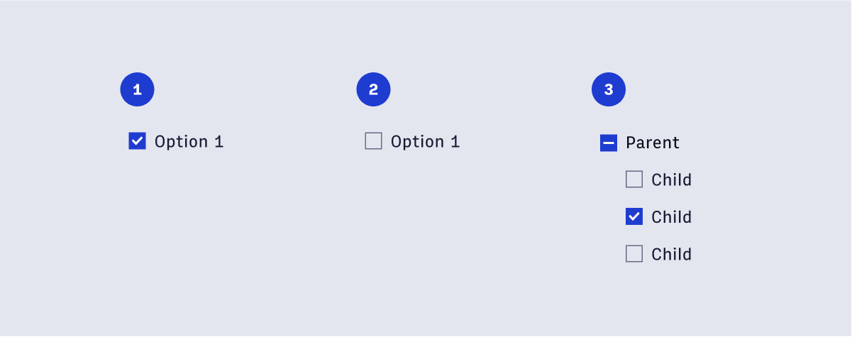
Checkboxes are used for a list of options where the user may select multiple options, including all or none. Use checkboxes when the list of available options are less than 8. By Default, all options should be unselected.
🚧 Under construction
This component is under active development. If you need this component for your project, create an issue in the GitHub repo.
Features
Used for selection elements that are less than 8 in count.