 Arc Design System
 AlertDialog
An AlertDialog is a type of modal window that appears in front of app content to provide critical information or ask for a decision. Dialogs should always be in response to a user action and should never appear unprovoked.
🚧 Under construction
This component is under active development. If you need this component for your project, create an issue in the GitHub repo.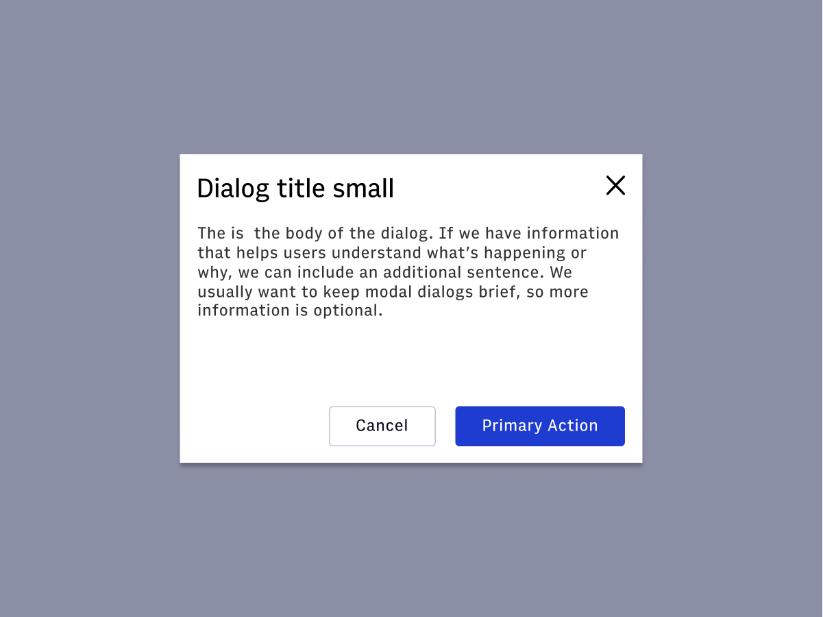
Features
A Dialog that requires the user to take action to move forward.
#Component structure
#1. Title
#2. Supporting text
#4. Buttons
#Usage
 An alert displays an important, succinct message in the bottom right-hand
corner of the viewport.
An alert displays an important, succinct message in the bottom right-hand
corner of the viewport. Alerts are persistent and nonmodal, and require user input to take action
or dismiss.
Alerts are persistent and nonmodal, and require user input to take action
or dismiss. Alerts can utilize icons and variations in color for increased prominence.
#Priority
| Component | Urgency | Content | Behavior | Actions | Example |
|---|---|---|---|---|---|
| Snackbar | Low | Informational | Transient (3-10 seconds) | 0-1 | Featured added, "Successfully updated a shared draft" |
| Alert | Medium | Awareness of state | Persistent, nonmodal, dismissable | 1-2 | Your page has been successfully published |
| Alert Dialog | High | Require a choice/acknowledgement | Persistent, modal, dismissable | 1-2 | Are you sure you want to use the shared draft? |
#Accessibility considerations
- https://webaim.org/techniques/formvalidation/
- https://www.deque.com/blog/inclusive-design-tips-presenting-information-multiple-ways/
- https://www.w3.org/TR/wai-aria-practices/#alert
- https://www.w3.org/TR/wai-aria-practices/examples/alert/alert.html
- https://www.w3.org/TR/wai-aria-practices/#dialog_modal
- https://www.w3.org/TR/wai-aria-1.1/#alertdialog