 Arc Design System
 Heading
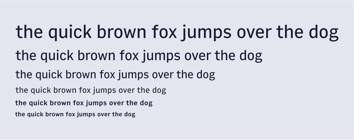
A component for setting h1-h6 headers.
Features
Easily adjust the header size through the component level prop.
Heading is used for rendering headlines--h1 through h6 tags.
#Import
import { Heading } from '@wpmedia/ads-typography'
interface HeadingProps
| Props | Description |
|---|---|
children(optional) | ReactNode |
css(optional) | NonLayoutCSSMaps to a subset of allowed CSS attributes on the Stitches |
id(optional) | undefined | stringThe element's unique identifier. See MDN. |
level | 1 | 2 | 3 | 4 | 5 | 6Level of heading corresponding to h1, h2, h3, h4, h5, h6 See MDN. |
#Usage
Heading composes Text so you can use all the Text props.
H1 Heading
H2 Heading
H3 Heading!
H4 Heading!
H5 Heading!
H6 Heading!