 Arc Design System
 Tabs
When used correctly, tabs create clarity and reduce clutter by selectively showing content. Many pages within the suite contain a large amount of content. Tabs can help break up that content, and reduce visual real estate, allowing the user to contextually unearth the information they need.
🚧 Under construction
This component is under active development. If you need this component for your project, create an issue in the GitHub repo.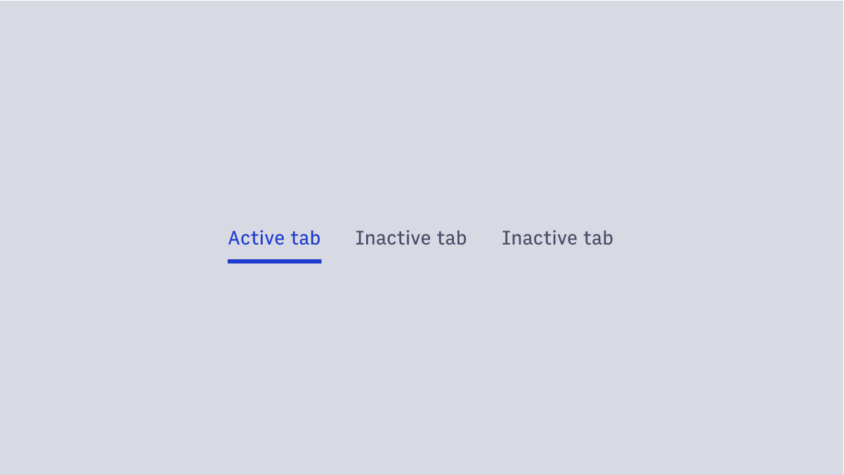
Features
Provides either page-level or inline tabbed experiences within Arc XP.
#Component Structure
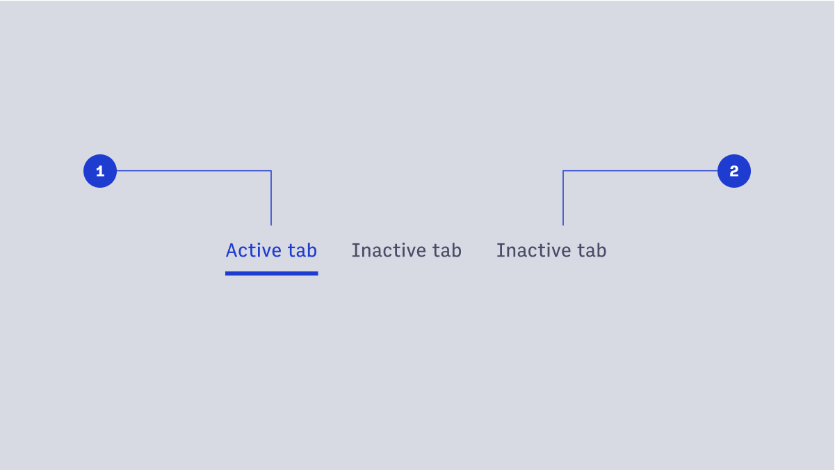
- Active tab
- Inactive tab
#Usage
- Page-level tab navigation
- Inline tabs
#Page-level tab navigation
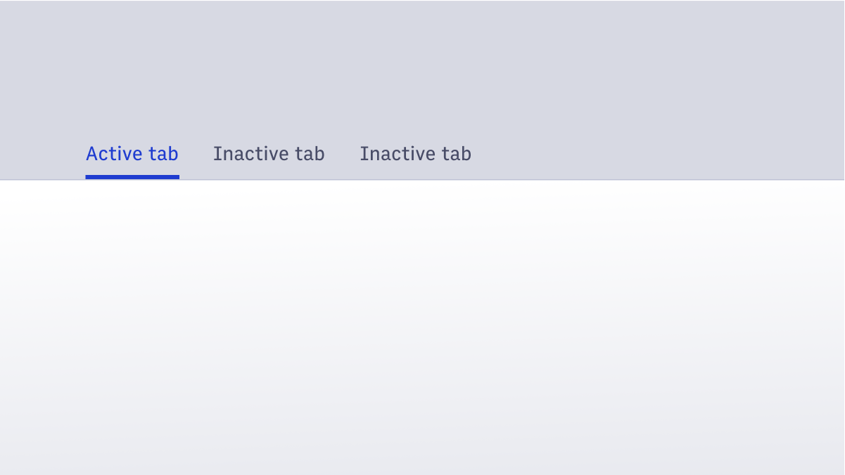 When tabs are used to create a page navigation within an experience, a page-level tab navigation is the recommended approach. This implementation has optional borders, to help further create separation between navigation and page content. Generally, as the user clicks through these page-level tabs, the URL is updated.
#Inline tabs
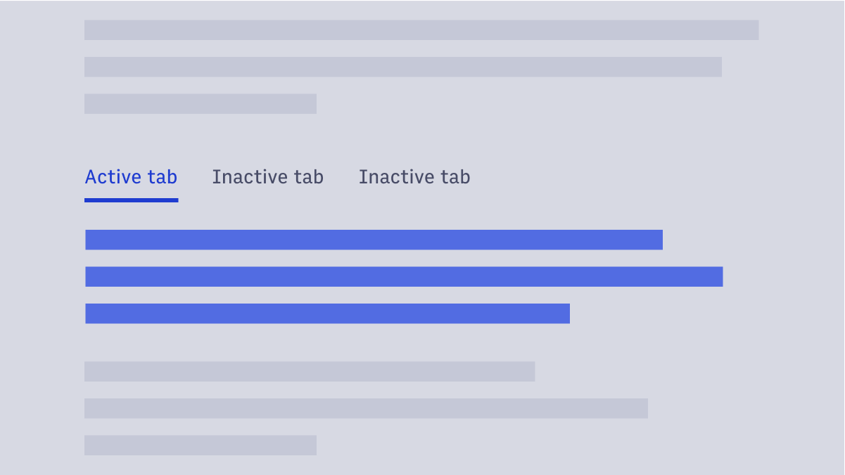 This pattern is for when tabs are useful on a page, but are not integral to way-finding.
Generally, inline tabs swap content out without changing the page’s URL.
This pattern is for when tabs are useful on a page, but are not integral to way-finding.
Generally, inline tabs swap content out without changing the page’s URL.
#Tab sizes
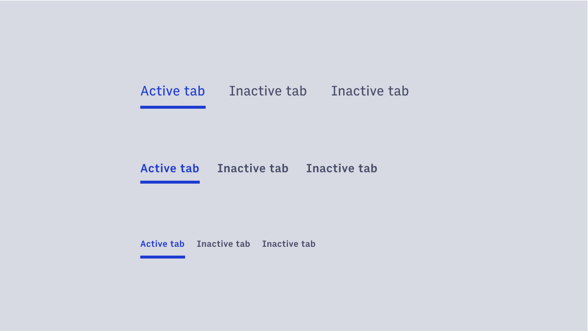 Inline tabs are available in three different sizes: small, medium, and large.
#Dark mode
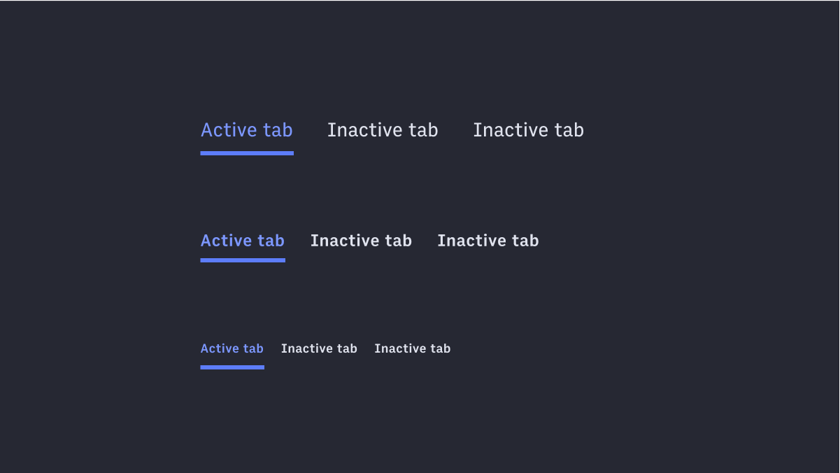 Tabs are also supported in dark mode.