 Arc Design System
 CheckboxGroup
A component that groups together checkboxes, and arranges them to be inline with the design system's form patterns. Use checkboxes when the list of available options are less than 8. By Default, all options should be unselected.
🚧 Under construction
This component is under active development. If you need this component for your project, create an issue in the GitHub repo.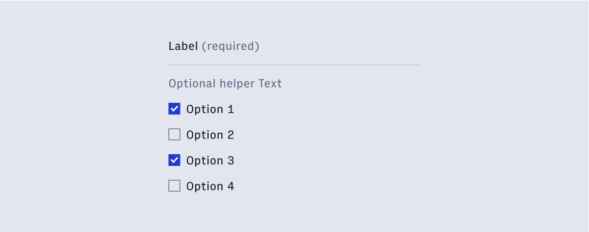
Features
Groups together checkboxes into a format that is consistent with other form elements.
Used for selection elements that are less than 8 in count.
#Component structure
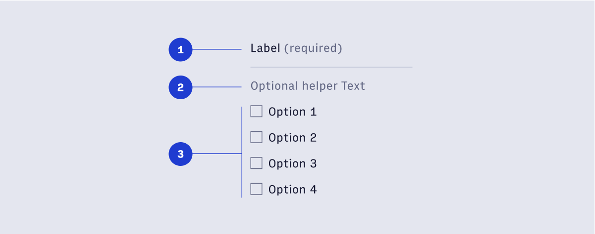
- CheckboxGroup label and required text.
- Optional helper text.
- CheckboxGroup options.
#Usage
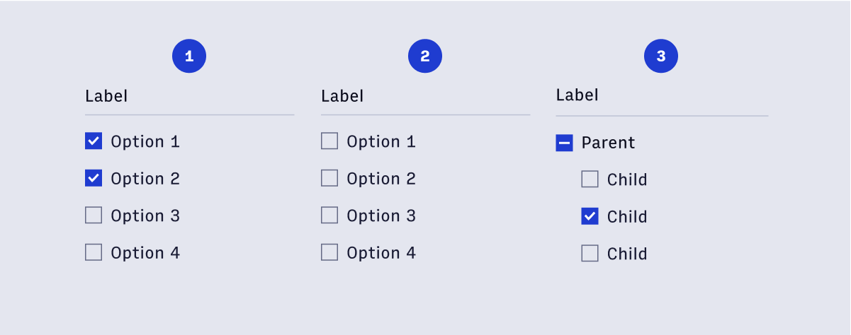 Checkboxes allow for 3 states:
- Selected
- Unselected
- Indeterminate
#Indeterminate state
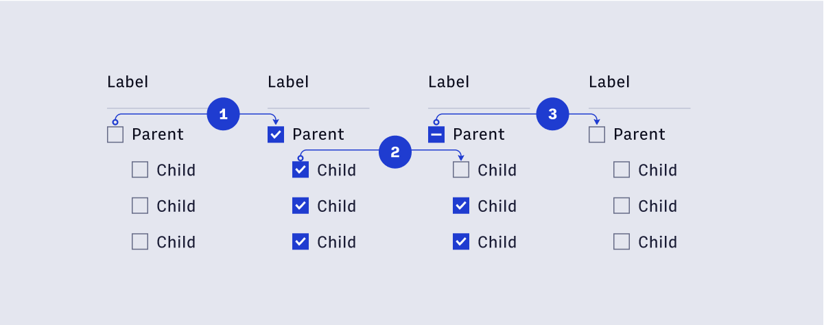
- When Selecting the parent checkbox, all child checkboxes are selected.
- If a child checkbox is unselected, the parent checkbox’s state is indeterminate.
- Selecting an Indeterminate checkbox will deselect all child checkboxes.