Chiclet

Chiclets allow users to see what selections have been made and make changes to those selections in an organic way. A group of chiclets which represent selected objects or properties forms as users select options from the interface.

🚧 Under construction

This component is under active development. If you need this component for your project, create an issue in the GitHub repo.
Chiclet

Features

A UI element that represents a selection the user has made.

#Component structure

Chiclet component structure diagram
  1. Container
  2. Label
  3. Remove button
  4. Remove button hover state

#Variants

Chiclet component structure diagram 
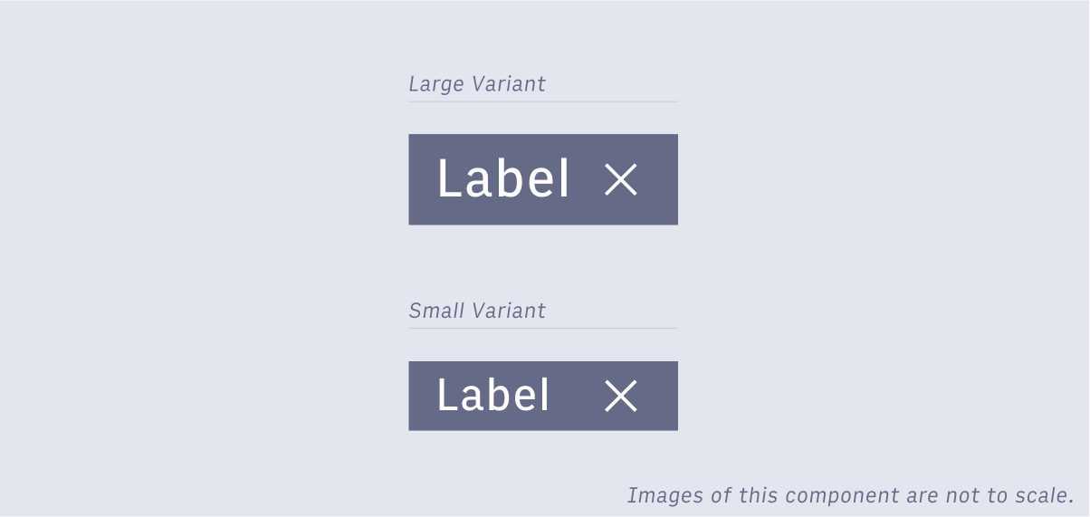
Chiclets have a large and small variant. Large variants use the large body copy styling for text. Small variants use the small body copy styling for text. Icon sizing remains consistent for both variants (16px).

#Usage

There are two ways to use chiclets as a selection pattern. The first is to show or allow the selection of an existing object or property. The second is to add and select a new property for an object. This second case may not be used in Arc, but is captured here for the sake of completion. In either case a chiclet should usually provide a way for a user to remove it as well. A system which uses chiclets to represent selected options requires a way for a user to select an option, a way to see that the option is selected - seeing the chiclet representing that option, and a way to remove a selected option, in essence deselecting it. Chiclets can act as stand alone selections made by either the system or a user through another interface. Whether the chiclets exist inside of another pattern’s container or not is at the designer’s discretion. Different ways to use chiclets
  1. User selected chiclets in a drop down selector.
  2. Read only chiclets.

#Selecting options with chiclets

Chiclets can be used to provide the user multi-select functionality as part of other interfaces. They are very flexible, but should only be used to serve the use cases described above. It’s common for chiclets to be selected by a pattern such as a drop down selector then to display near the selector or inside of the selector’s container. See drop down selectors for more information.

#Adding properties with chiclets

A common use for chiclets is to tag something like an article or photo with meta-data. Some of the tags may exist already, in other cases a user may want to add new tags. The chiclet pattern should include a way for users to enter a custom value that the chiclet will represent.

#Chiclets vs similar selection patterns

Why not use a dropdown on its own? Drop-downs generally only have 1 selected value out of the options available. Checkbox drop-downs allow users to select more than one option, but aren’t really suited for very long lists of options. Why not use checkbox list or grid? Checkboxes are great for small lists of options that clearly relate to one another. Dropdown lists or grids take up a lot of space on a page, so don’t work well for long or open ended lists of options.
Copyright 2021 Arc XP