 Arc Design System
 Alert
An Alert displays an important, succinct message, and provides an action for user to address (or dismiss the Alert). It requires a user action to be dismissed.
Features
Used for critical messages that require the user to address or dismiss.
Requires user to dismiss the alert.
An
Alerts are shown one at a time and must be dismissed. You can have both alerts and snackbars at the same time.
AlertDialogs are a specific type of Dialog. They display important information that users need to acknowledge, main difference with dialog component is that alert will need an action and no closing when any action outside the modal window.
Alerts should be displayed at bottom right-hand corner of the viewport. They are persistent and non-modal, allowing the user to either ignore them or interact with them at any time.
Alerts can make use of the iconography and have color variations for more visual prominence if needed.
 An alert displays an important, succinct message in the bottom right-hand
corner of the viewport.
An alert displays an important, succinct message in the bottom right-hand
corner of the viewport. Alerts are persistent and nonmodal, and require user input to take action
or dismiss.
Alerts are persistent and nonmodal, and require user input to take action
or dismiss. Alerts can utilize icons and variations in color for increased prominence.
Alerts are classified as medium urgency. Alerts communicate actionable messages that often require a certain level of awareness, and are moderately interruptive to the user experience.
The status determines what color the alert will be.
Alert is a variation on the Snackbar component, with additional elements to compliment an increased urgency level. An Alert displays an important, succinct message, and provides an action for user to address (or dismiss the Alert). It requires a user action to be dismissed.
Note
See guidelines on Notifications for help in selecting the correct type of notification.#Import
Caution
Avoid importingAlert directly and instead use the provided
notification hook: useNotification.import { Alert } from '@wpmedia/ads-alert'
interface AlertProps
| Props | Description |
|---|---|
children | ReactElement<ButtonProps>[] | ReactElement<ButtonProps>Alert notifications can have 1 or 2 actions |
label(optional) | ReactElement | stringThe title that is displayed in the notification |
message | ReactElement | stringThe message that is displayed in the notification |
status(optional) | "base" | "info" | "warning" | "success" | "publish" | "error" = baseStatus affects color scheme and icon used. Valid status strings are 'warning', 'success', 'base', and 'info'. |
#Usage
#Component structure
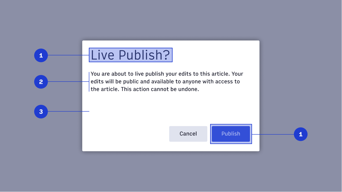
- Title and actions
- Content
- Modal window
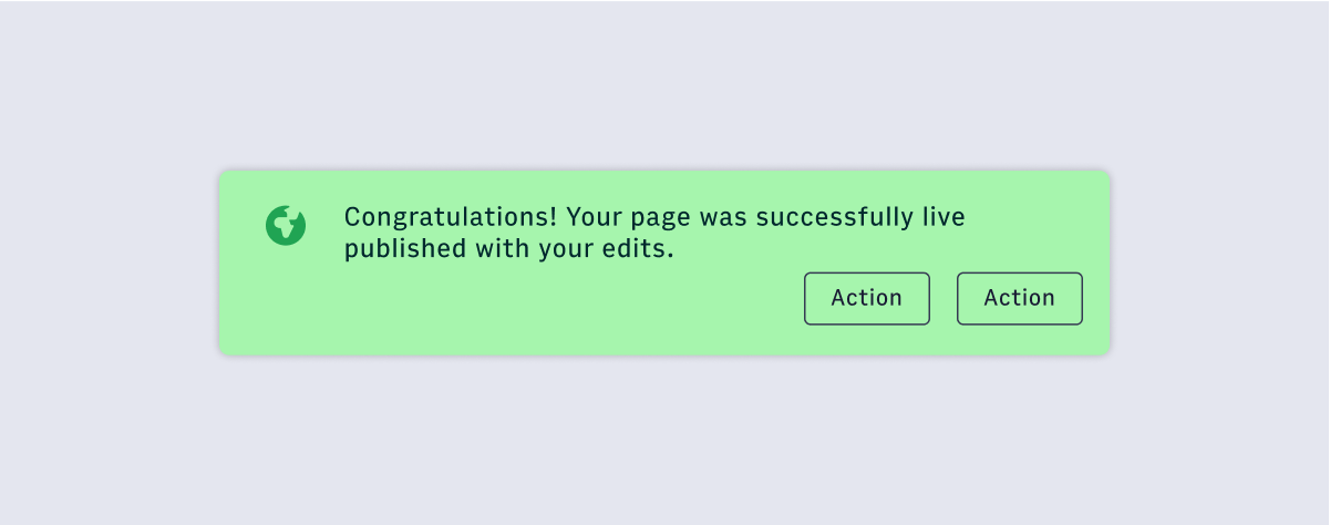
1. Icon
Icons should be used in combination with container color to communicate urgency and the type of alert. They will always appear in the top left-hand corner of the container. Refer to icon library for a list of acceptable icons to use inside alerts.3. Supporting Text
The supporting text should be concise and limited to two or three sentences. There should be no more than three lines of text. If the copy spills over to four lines, try again.2. Container
The container should use a min-width of 540px and a max-width of 640px (including padding). Horizontal and vertical padding should remain consistent at 24px. These are the default values set by Alert. Refer to Usage for code examples.4. Action
Alerts require acknowledgement before closing. The action can either pertain to the Alert message at hand (ie: Viewing errors) or be used to dismiss the Alert.#Usage
An alert displays an important, succinct message in the bottom right-hand
corner of the viewport.Alerts are persistent and nonmodal, and require user input to take action
or dismiss.Alerts can utilize icons and variations in color for increased prominence.#Priority
| Component | Urgency | Content | Behavior | Actions | Example |
|---|---|---|---|---|---|
| Snackbar | Low | Informational | Transient (3-10 seconds) | 0-1 | Featured added, "Successfully updated a shared draft" |
| Alert | Medium | Awareness of state | Persistent, nonmodal, dismissable | 1-2 | Your page has been successfully published |
| Alert Dialog | High | Require a choice/acknowledgement | Persistent, modal, dismissable | 1-2 | Are you sure you want to use the shared draft? |
#Status
Default
The default Alert should communicate neutral information about the system.The most basic of alerts that maybe you might have on your website
Warning
The warning Alert should communicate information that might need user attention.Be careful...
Success
The success Alert should communicate when an action has been completed successfully.The most basic of alerts that maybe you might have on your website
Publish
The publish Alert should communicate when an action involves something being published to a live audience.The most basic of alerts that maybe you might have on your website
Error
The Error Alert should capture any system errors or communicate when an action cannot be completed.The most basic of alerts that maybe you might have on your website
Info
The Info Alert should communicate neutral information about the system.The most basic of alerts that maybe you might have on your website
#Accessibility considerations
- Use
role="alert"so that the screen reader will provide the user notification at the same point a sighted user would experience it. - Keyboard support isn’t needed.
- https://www.w3.org/TR/wai-aria-practices/examples/alert/alert.html