One primary goal of the design system is for components to not affect anything outside of itself--components should be usable in any context or layout.
By using a stack, Arc UI can create simple but common flex layouts without components needing to be aware of where they are placed in a layout. Also, using stacks can help limit space between elements to be from the Arc UI spacing scale.
import { VStack, HStack } from '@wpmedia/ads-layout'
Stack is best used sparingly, when elements require a consistent spacing among the other children.
When placing elements into a vertical stack, use the component VStack
When placing elements into a horizontal stack, use the component HStack
Stacks can be nested to create simple layouts.
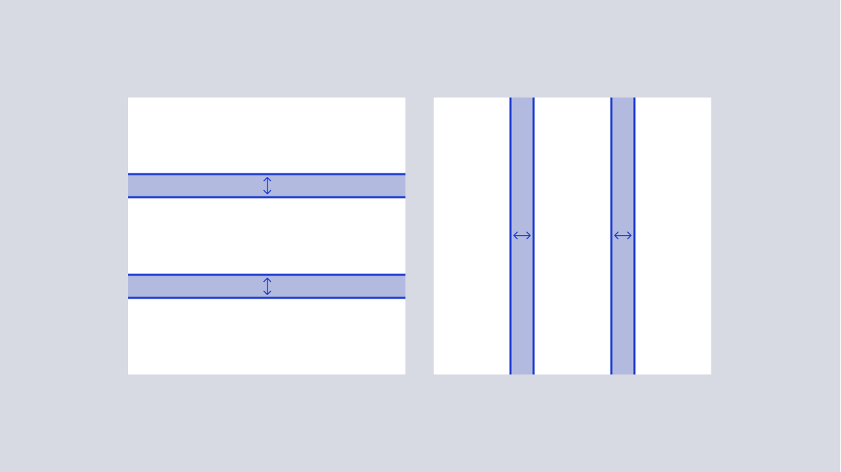
Spacing is unique to the use case. The components accept a spacing token via the gap prop.
 Arc Design System