 Arc Design System
 OverflowMenu
OverflowMenus contain a list of actions in a menu, that is hidden until the user clicks on the OverflowMenu button. Used throughout Arc XP, the OverflowMenu keeps key actions close by in a clean and unobtrusive menu.
Features
Hides non-critical actions out of the user's view.
Handles overflows of menus where all items cannot be displayed.
#Import
OverflowMenu: The wrapper component that providesMenuOption: Trigger that handles selection. Must be a child ofOverflowMenu.
import { OverflowMenu, MenuOption } from '@wpmedia/ads-menu'
interface OverflowMenuProps
| Props | Description |
|---|---|
children | ReactElement<MenuOptionProps>[]Menu items must use the MenuOption component to wrap content. |
label | stringLabel for the tooltip on the icon button. See Tooltip label |
onAction(optional) | anyHandler that is called when an item is selectd. |
placement(optional) | anyDictates where the menu options will populate. |
#Usage
#Component structure
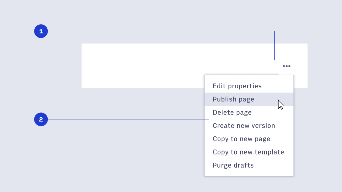
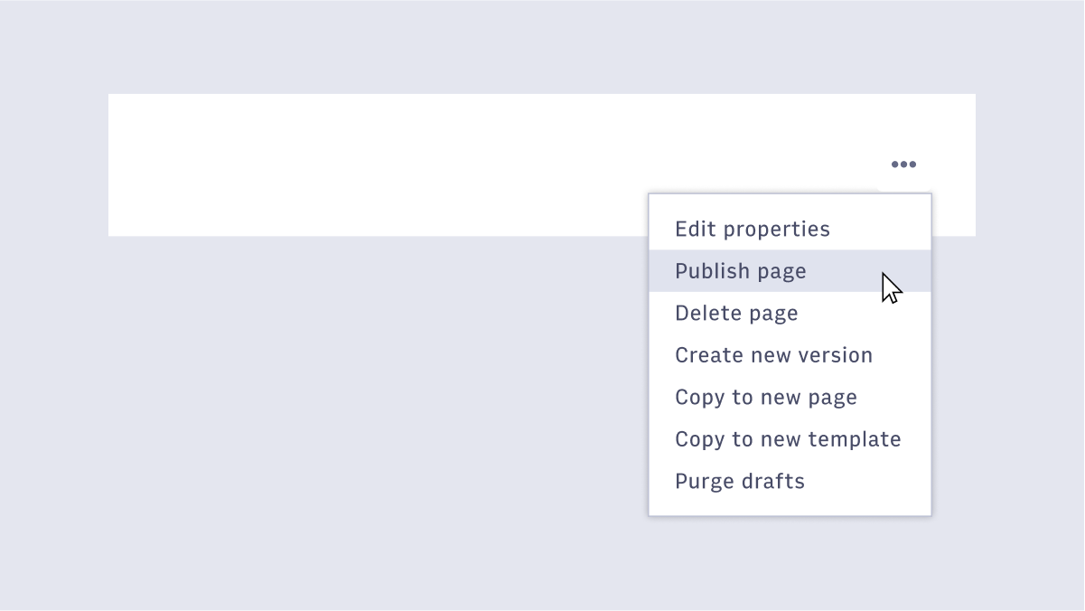
- OverflowMenu button: The button that triggers the OverflowMenu.
- OverflowMenu: The menu itself, containing a list of menu items.
#Usage
#Disabled menu item
For menu items that are currently disabled, use Gray-300 to create less contrast, helping the user understand the menu item is currently disabled/unavailable.
#Destructive menu item highlight
OverflowMenus sometimes contain menu items that are destructive in nature. Use the danger color on hover to communicate to the user that the action is critical and will result in a destructive effect. This is best paired with a confirmation dialog.