Arc Design System
 TextField
A form UI element that accepts a text string from the user.
🚧 Under construction
This component is under active development. If you need this component for your project, create an issue in the GitHub repo.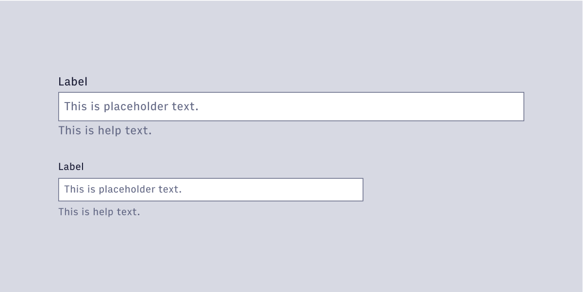
Features
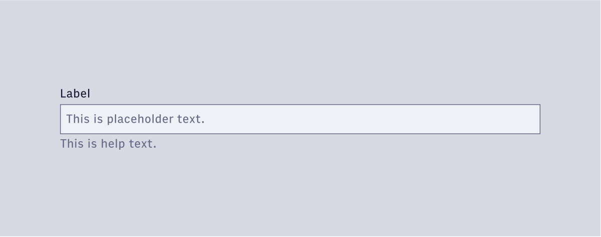
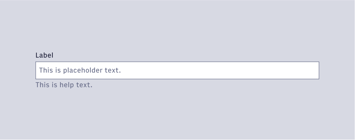
A standard text input field that accepts a string.
#Component structure
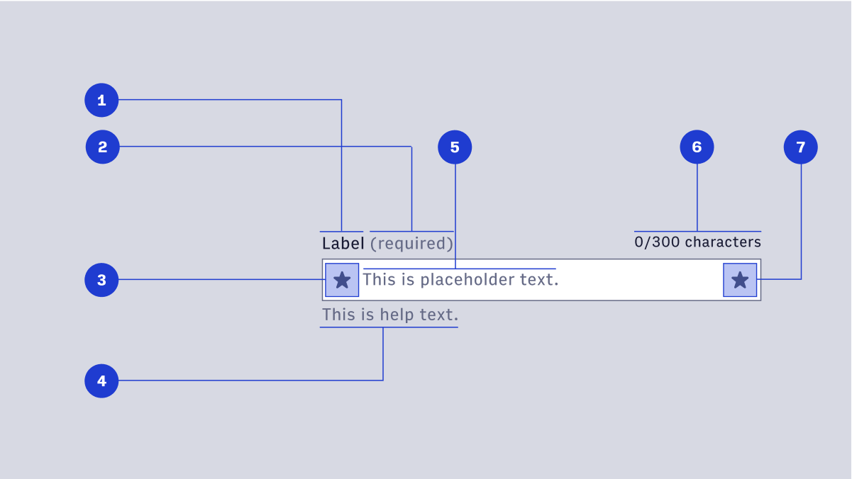
- Label: Label text is used to inform users as to what information is requested for a text field. Every text field should have a label.
- Required label
- Left icon (optional): The icon on the left is generally static and is used to communicate what type of field it is (e.g. adding a search magnifying glass to denote search.)
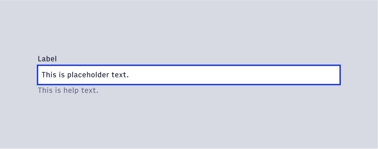
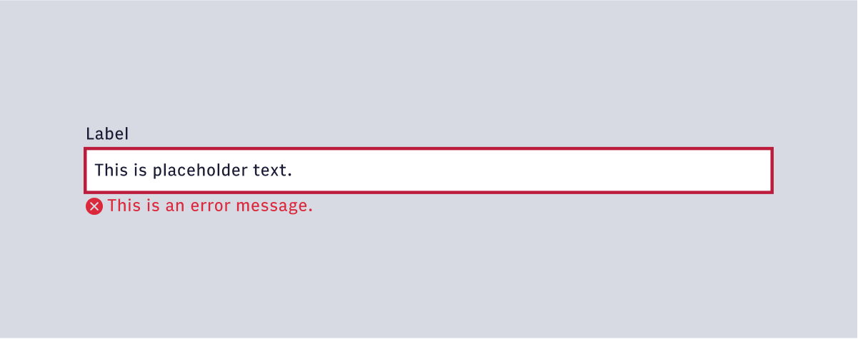
- Help text (optional): Help Text conveys additional guidance about the input field, such as how it will be used. It should only take up a single line, being persistently visible or visible only on focus. Error messages will take the place of Help Text when necessary. Error messages will take the place of Help Text when necessary, see Error Handling for more information.
- Placeholder text: Placeholder Text can be used literally describe the action to be taken by the user, or provide an input example. For example, “Enter name” or “John Doe” for a text field that requires a name.
- Character count (optional): For fields that have a maximum character limit.
- Interactive icon (optional): An icon that is reserved for additional functionality. This icon is generally interactive and exposes additional menus when interacted with.
#Variants
Text fields have a large and small variant. Large variants use the large body copy styling for text elements and large icon sizing (24px) for icon elements. Small variants use the small body copy styling for text elements and small icon sizing (16px).
#Usage
#Default
#Focus
#Danger
#Disabled