 Arc Design System
 DateTimePicker
Pickers are used to select past, present, or future dates or times. Each picker’s format is made out of other components and can be customized depending on the product need. The date picker component is capable of rendering a date picker, time picker, or combinations of both. Each picker includes documentation for usage, component structure, interactions and accessibility.
🚧 Under construction
This component is under active development. If you need this component for your project, create an issue in the GitHub repo.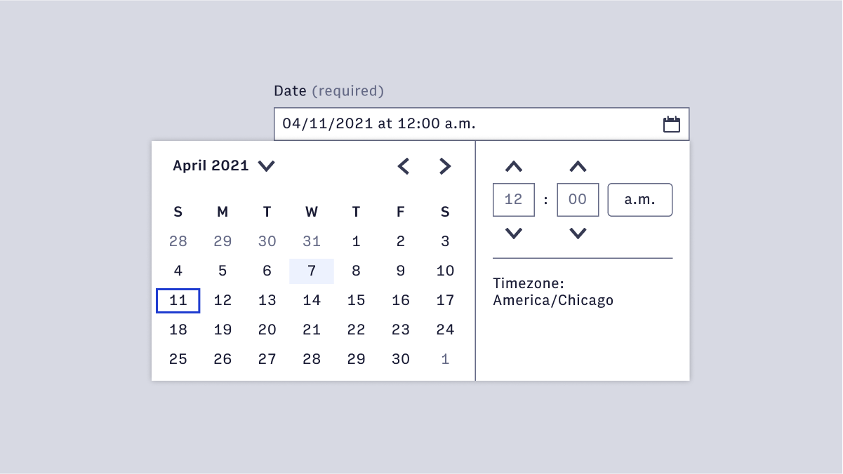
Features
Form component that facilitates selecting a date, a time, and a date/time combo.
#DatePicker
- Setting a publish time
- Filtering content
- Scheduling a task
- Defining start and end dates
- Credit card payment date
#Full dates (mm/dd/yyyy)
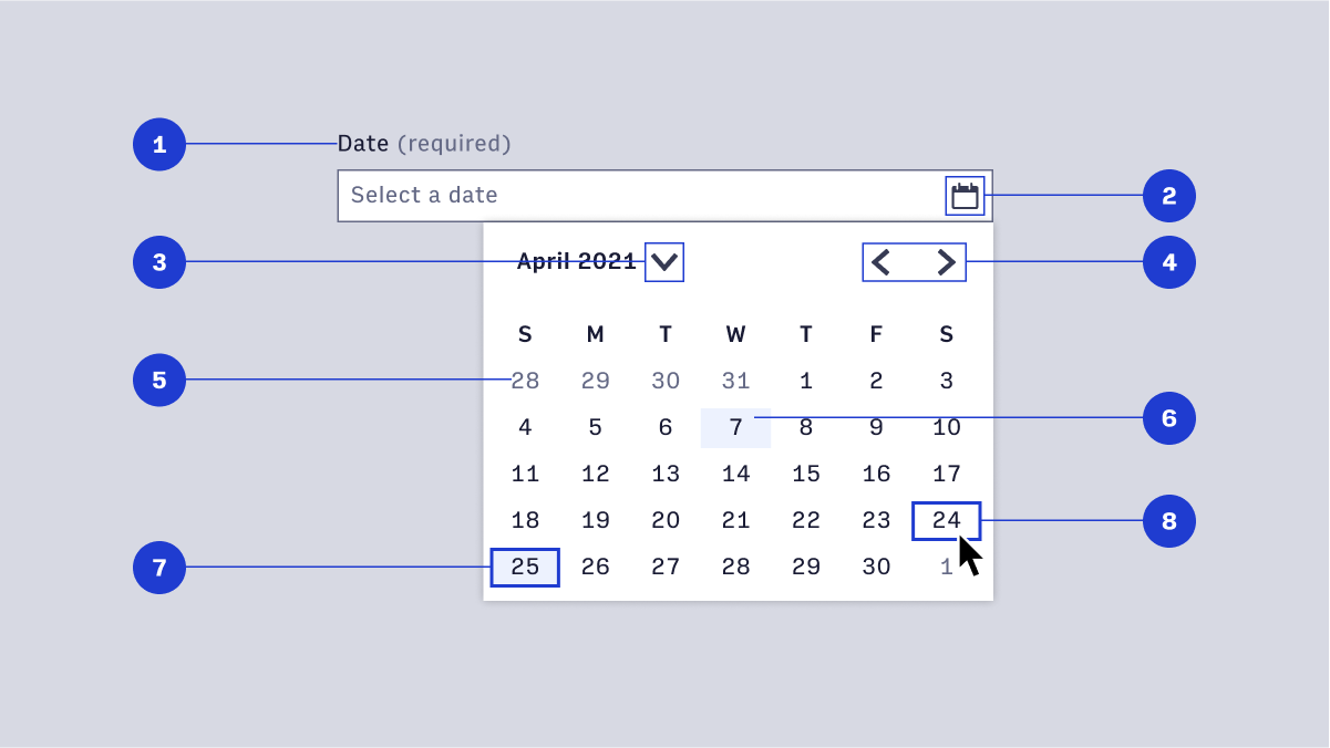
- Label
- TextField interactive icon
- Closed chevron year selection menu
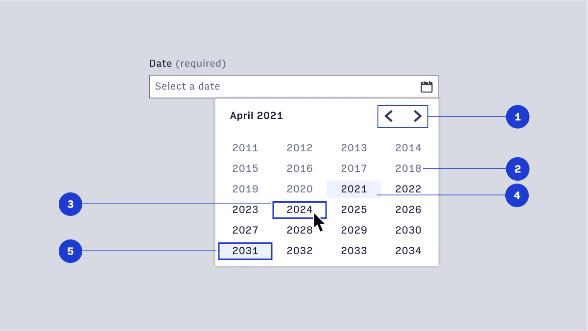
- Month pagination
- Date outside current month
- Current date
- Selected date
- Hover/Focus state
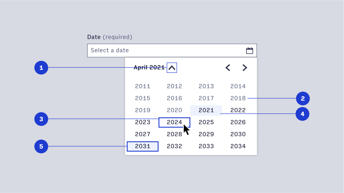
- Opened year selection menu
- Past year
- Hover/focus year
- Current year
- Selected year
#Date and year (mm/yyyy)
- Label
- Input interactive icon
- Month pagination
- Scroll
- Current year
- Selected year
- Hover/focus year
- Past year
- Selected month
- Input selected date
#Time Picker
- Setting a publish time
- Filtering content
- Scheduling a task
- Defining the start time and end time
#12-Hour time (12:34)
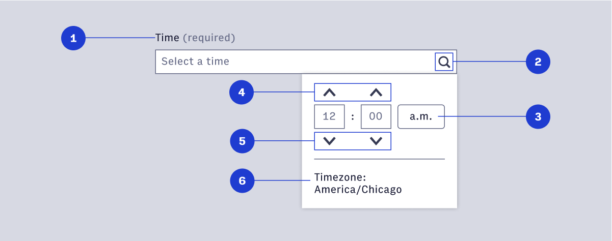
- Label
- TextField interactive icon
- a.m./p.m. selection button
- Increment hours/minutes
- Decrement hours/minutes
- Timezone
#24-Hour time (16:34)
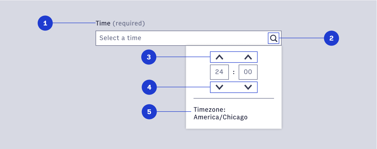
- Label
- TextField interactive icon
- Timezone
- Decrement hours/minutes
- Increment hours/minutes
- Timezone
#Selecting date and time
Date pickers let users choose dates from a visual calendar that’s consistently applied wherever dates need to be selected across Arc.
Date/Time pickers provide the user to select a date and a time. The picker should be used when both time and date are needed and have the same function and interactions of the separate date and time picker.
Common use cases include:
- Setting a publish time
- Filtering content
- Scheduling a task
- Defining the start time and end time