 Arc Design System
 Button
Most of Arc’s interfaces incorporate buttons allowing users to take actions. They need to be discernible from the rest of a view's content, show some form of feedback from user actions, and need to provide some indication of what the user should expect if clicked.
Features
Distinct components to help key features/functionalities stand out within an interface.
#Import
import { Button } from '@wpmedia/ads-button'
interface ButtonProps
| Props | Description |
|---|---|
as(optional) | "button" | "a" | React.ReactNode = 'button'Allow for button to be rendered as an anchor or button also allow for a Router component (like from react router) |
children | ReactNodeText content of the button |
icon(optional) | React.ReactElement<IconProps>Icon to render to the left of the button text. This component should not include any additional properties. E.g., |
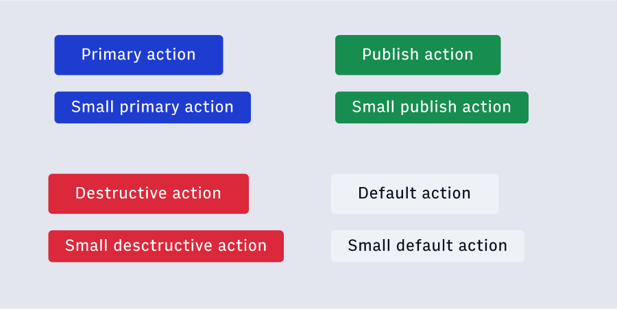
variant(optional) | "default" | "primary" | "publish" | "destructive" | "ghost" | "outline" | "outlinealert" = 'default'The semantic color variant of the button |
#Button Types
#Buttons without Icons (default)
#Buttons with Icons
iconName prop to add an Icon to a Button component.
Note
When looking to create cuttons with icons without text, refer to theIconButton component.#Primary Buttons
Primary Buttons are used for a key action which a user is most likely to take. We use a primary button when we want to indicate to a user that this is likely the next step which they want to take. Use primary buttons sparingly, only when the action should be emphasized over others in an interface pattern or on a view.
#Default Buttons
Default Buttons should be the most common buttons in a design. Use these for supporting or secondary actions in an interface. Additionally default buttons should be used when no clear hierarchy is needed to provide the best user experience.
#Outline buttons
Outline Buttons are a third option used to denote a deemphasized action. These will often be ‘utility’ actions such as ‘Cancel’ or ‘Discard Changes’. Generally these buttons are used when the weight of the action should be pretty late in relationship with other actions, the rest of the interface, or view.
#Ghost buttons
Ghost Buttons are an additional option used to denote a deemphasized action. The element itself is a button, but visually does not read as one until the element is active and/or focused.
#Disabled buttons
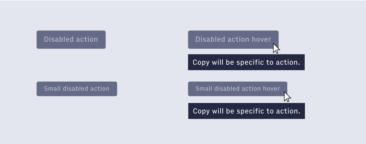 Disabled Buttons communicate when a component or element isn’t interactive and should be deemphasized in the UI. To provide clear guidance on what is disabled the hover state of the button supports the specific action that is disabled within a tooltip. The disable button is a distinct button that is used across all button actions when needed.
#When to use a button
#onPress versus onClick
onPress instead of onClick. The components in ADS, including the Button component, are built on react-aria and react-stately libraries. Following the example of Adobe Spectrum we've updated our handlers from onClick to onPress.
For more information on the reasoning behind this, see the thorough explanation from the Spectrum design system team.