 Arc Design System
 Card
Cards group related information in a flexible-size container. A card will represent a subject, such as a piece of content, and display information relevant to the user about that subject. Cards often provide an entry point to further details on their subject.
🚧 Under construction
This component is under active development. If you need this component for your project, create an issue in the GitHub repo.
Features
A component that contains and gives structure to information.
Entire card may be clickable, or just certain areas.
#Usage
- Display content composed of different elements or data types (photos, videos, text, ect.)
- User to browse through or explore the content, instead of just scanning (tables are better for scanning).
- Show a preview of what the card represents in relationship to other content. Users can elect to view more detailed information by interacting with the card.
#Card design guidelines
- Determine the hierarchy of content on the card clearly.
- Single subject for the card. A card should not represent more than one idea or object.
- Avoid unnecessary borders and drop shadows. Use the elevation to show when a card is being interacted with (drag and drop for example).
- Most important elements of a card (often and image or headline) should be in the upper area of a card and left justified. Consider how the card would work if right justified for internationalization purposes.
- Use design system spacers to define space between content elements. The card’s container has padding of 16px/1rem. Additional spacing may be accounted for with margins on the content as needed.
- Divider lines (1px, solid, Gray300) can be used to break up content.
#Component structure
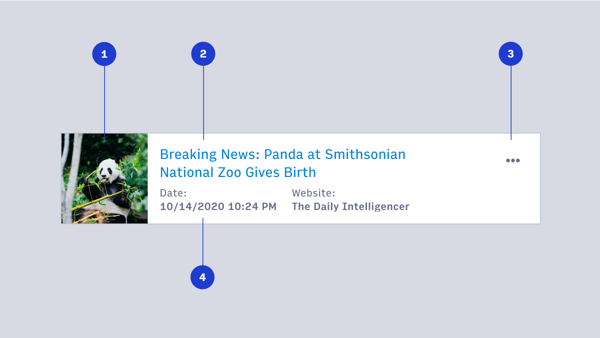
- Image
- Title or headline
- Overflow menu
- Detailed information
#Card behavior
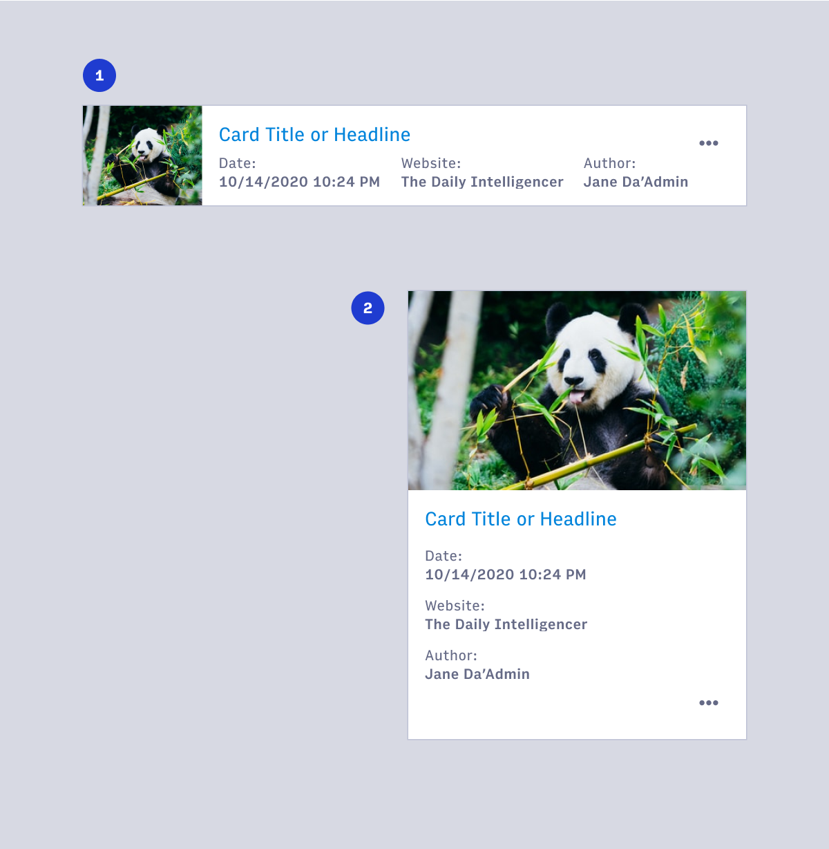
- Desktop card
- Mobile, tablet or small viewport card
#Cards & tables
#When to use cards
- When there is a large amount or many types of information to be displayed (images, headlines, and badges for example).
- When you want the user to browse content instead of scanning for specific information.
- When screen real-estate is less important than information hierarchy.
- When visual impact is important for the display of information.
#When to use tables
- When the primary task is to compare different but related objects with nearly identical data points.
- When there are fewer or shorter data points in the information.
- When users need to manipulate tabular information. Adding or removing columns as needed, or sorting and filtering as a primary action for the user (Note: sorting and filtering can apply to lists of cards as well).
- When simple and clean display of information with little hierarchy and variation is needed.
#Accessibility
- Use list markup to group your cards
- Make sure your cards don't break when lines of content wrap or images don't meet specific aspect ratio requirements
- Avoid too much functionality and reduce tab stops. Cards shouldn't be miniature web pages.
- Remember that headings should begin sections. Most everything that belongs to the section should follow the heading in the source.
- (source: https://inclusive-components.design/cards/)