 Arc Design System
 IconButton
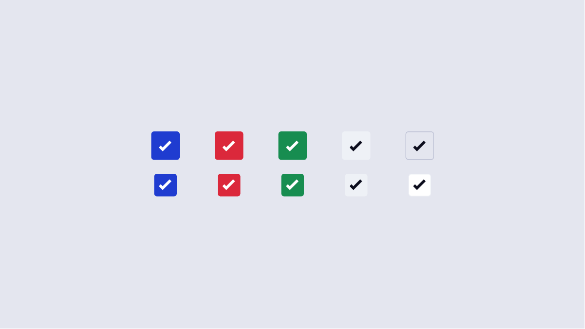
Icon Buttons are buttons within Arc that only have an icon inside. These buttons are used sparingly, but are often required on complex screens.
Features
Pairs with a Tooltip to provide context around the functionalities of the IconButton.
#Import
import { IconButton } from '@wpmedia/ads-button'
interface IconButtonProps
| Props | Description |
|---|---|
label(optional) | undefined | stringOptional label for the icon button |
position | undefined | "bottom" | "bottom left" | "bottom right" | "bottom start" | "bottom end" | "top" | "top left" | "top right" | "top start" | "top end" | "left" | "left top" | "left bottom" | "start" | "start top" | "start bottom" | "right" | "right top" | "right bottom" | "end" | "end top" | "end bottom"Position of the corresponding tooltip |
#Usage
#Component structure
- Background container - This is what makes up the body of the button. This also is the hitzone for the button, accomodating touch screen devices.
- Icon - The icon component within the icon button. Read more about icons.
#Usage
#Do
- Use the various button types & best practices.
- All icon buttons must be paired with a tooltip. This is critical for building our users’ visual vocabulary, while also providing context. Some icons may not be inherently understandable without the tooltip.
- Use button states (ex. Using an icon button for delete should be red, since it is a destructive action). See button states.
- For the icons inside the button, do not detach the coupled
SVG title. This is important for screen readers. Generally, theSVG titleshould also match the tooltip.
#Don't
- Change any color of Icons. Icons inherit fill, hover, and other properties based on the parent element.