 Arc Design System
 Select
A dropdown that allow the user to select only 1 item from a list.
Features
Dropdown for when the user can only select 1 option from a list.
#Overview
#Component structure
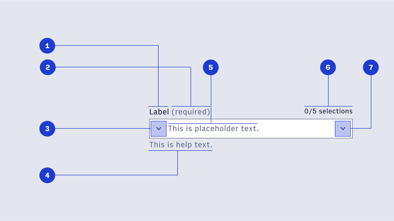
#Closed structure
- Label Label text is used to inform users as to what information is requested for a text field. Every text field should have a label.
- Required label (optional) [🚧 Under construction] This label appears when a select component is required for the form to successfully be completed.
- Display Icon (optional) A Display Icon can describe the type of input a text field requires, and be touch targets for nested components. For example, a calendar icon may be tapped to reveal a date picker.
- Help Text (optional) Help Text conveys additional guidance about the input field, such as how it will be used. It should only take up a single line, being persistently visible or visible only on focus. Error messages will take the place of Help Text when necessary, see Error Handling for more information.
- Placeholder Text (optional) Placeholder Text can be used literally describe the action to be taken by the user, or provide an input example. For example, “Enter name” or “John Doe” for a text field that requires a name.
- Number of maximum items (optional) This label lets the user know what the maximum number of selections is.
- Interactive Icon An Interactive Icon is an optional icon that should always have an action tied to it. For example, a magnifying glass to signify a search action, or caret to indicate a dropdown.
import { Select, Option } from '@wpmedia/ads-select'
interface SelectProps
| Props | Description |
|---|---|
children(optional) | ReactElement<OptionProps>[]Contents of the dropdown list (each item must be a Option component). |
disabled(optional) | undefined | false | trueWhether the input is disabled. |
helpText(optional) | undefined | stringContextual message shown beneath the field. |
isSmall(optional) | undefined | false | true = falseUse the small variant |
label | stringContent to display as the label for this select field. |
name(optional) | undefined | stringThe name of the select input, used when submitting an HTML form. |
onChange(optional) | undefined | (key: Key) => unknownHandler that is called when the selection changes. |
placeholder(optional) | undefined | stringText displayed when no item is selected. |
value(optional) | KeyThe currently selected key in the collection (controlled). |
#Open/focus structure
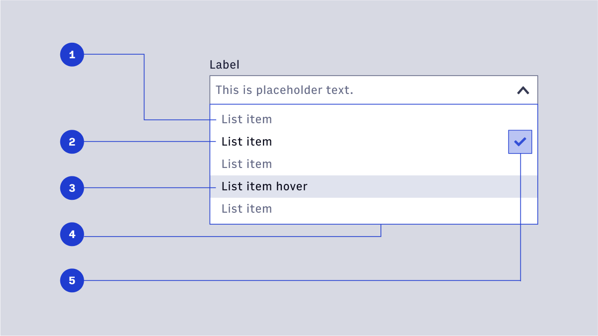
- List item (default): The default style list of selection items. Items should be concise and never extend to two lines. Text color is Gray 500 for non-active list items.
- List item (active): When an item is selected, the text color changes. Active items are paired with an icon (see below).
- Hover state: On hover, the background color on a row containing a list item changes. The list item text color changes.
- List container: The container should be tall enough to contain at least 5 list items before scrolling. The container will cover any help text or validation messaging.
- Selection icon: A small checkmark to indicate an item is selected.
#Size Variants
Choose wisely or your choice will be made for you