Arc Design System
 TextArea
Text Areas are taller than Text Fields and wrap overflow text onto a new line. They can be resized vertically to a maximum height and will begin scrolling when the cursor reaches the bottom.
🚧 Under construction
This component is under active development. If you need this component for your project, create an issue in the GitHub repo.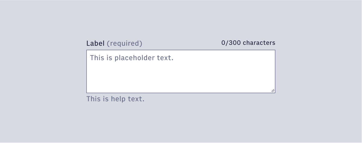
Features
A standard textarea input field that accepts a string.
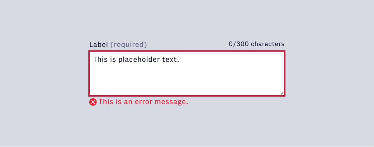
#Component Structure
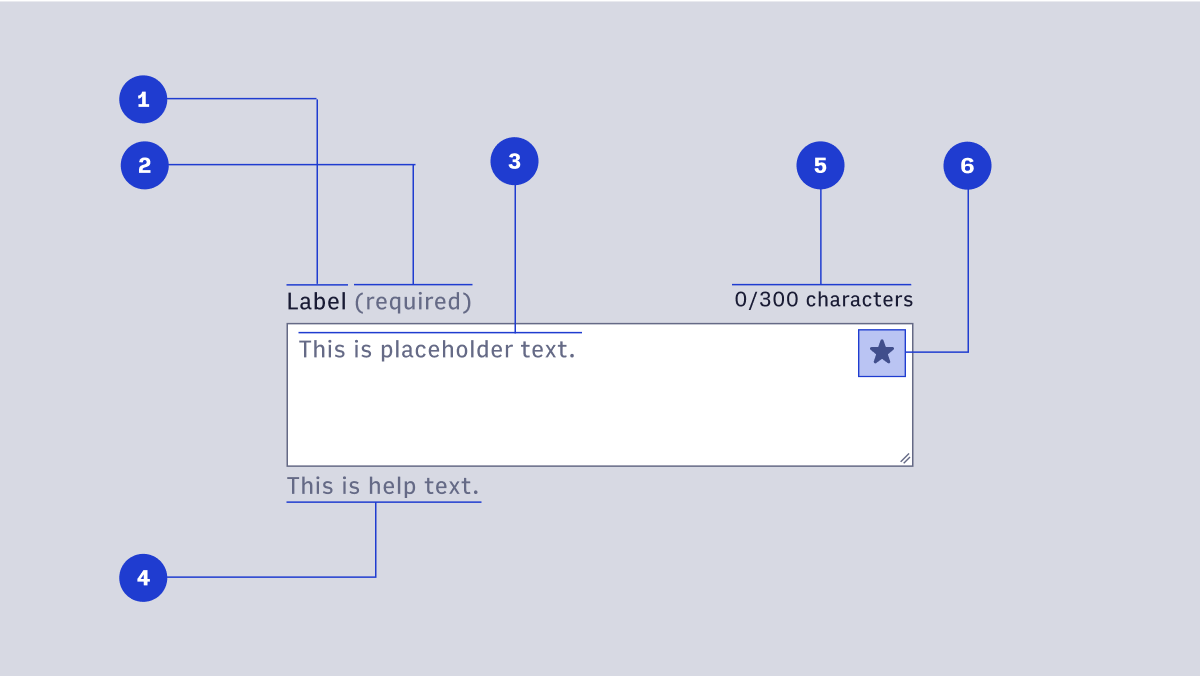
- Label: text is used to inform users as to what information is requested for a text field. Every text field should have a label.
- Display Icon (optional): A Display Icon can describe the type of input a text field requires, and be touch targets for nested components. For example, a calendar icon may be tapped to reveal a date picker.
- Help Text (optional): Help Text conveys additional guidance about the input field, such as how it will be used. It should only take up a single line, being persistently visible or visible only on focus. Error messages will take the place of Help Text when necessary, see Error Handling for more information.
- Placeholder Text: Placeholder Text can be used literally describe the action to be taken by the user, or provide an input example. For example, “Enter name” or “John Doe” for a text field that requires a name.
#Usage
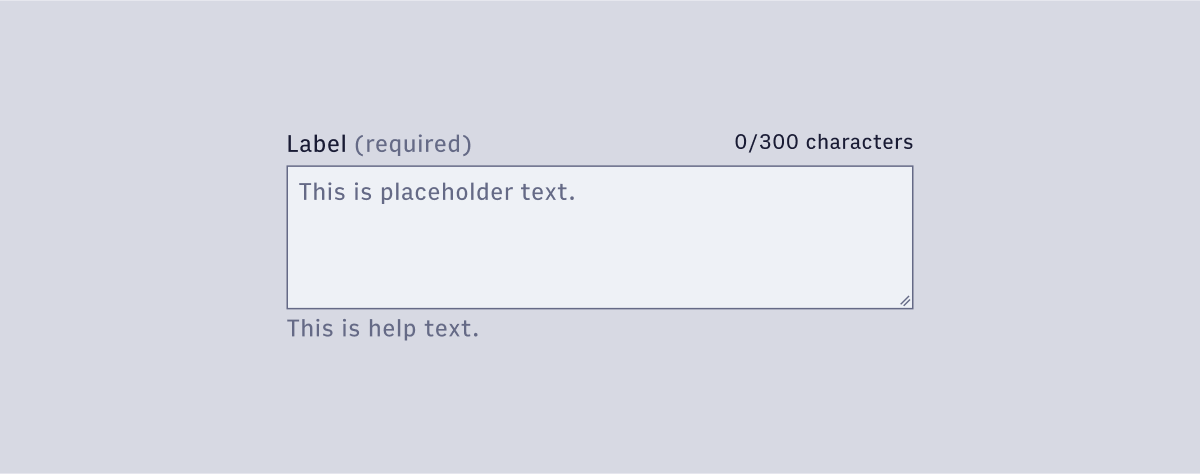
#Default
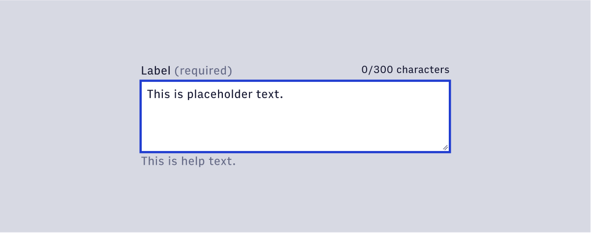
#Focus
#Danger
#Disabled