Pagination
Pagination allows users to view content in digestible amounts and navigate through that content which can be in the form of tables and lists (cards, images, videos). Pagination is typically visible above and/or below a body of content.

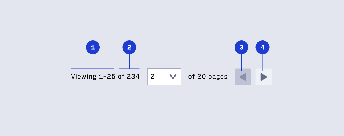
- Items in view
- Total number of items, “of many”, or “X+”
- Previous button disabled
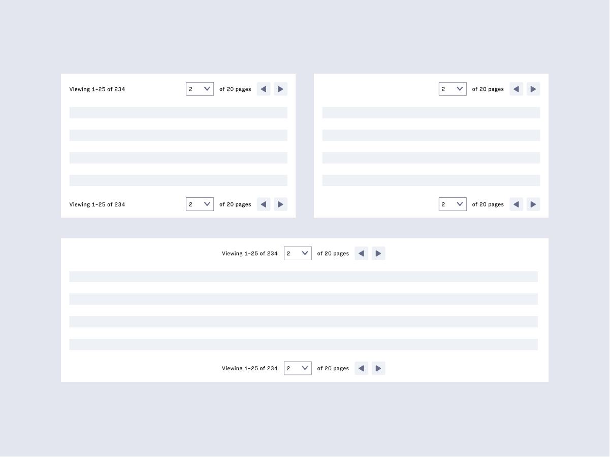
Page navigation and search result items can be placed above and/or below, aligned to the left/right/center of a body of content depending on the layout. See below for examples of options.
- User understands what page / number of items they are currently viewing
(a screen reader needs to be able to read these.)
- User can select a different
page to navigate to using the keyboard to control the dropdown (the dropdown
needs to be keyboard operable)
- User understands there is a disabled previous
button on the first page / set of items (resource: aria-disabled)
- User can navigate left and right via keyboard
Copyright 2021 Arc XP
 Arc Design System