 Arc Design System
 Color
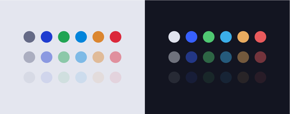
Getting started with the Arc color system.
#Primary brand color
Purple 500
hex#1f3cd0
react$purple500
$purple500.
#Light theme
#Neutrals
Gray 100
hex#eef0f6
react$gray100
Gray 200
hex#dfe2ee
react$gray200
Gray 300
hex#bdc2d5
react$gray300
Gray 400
hex#8b91ab
react$gray400
Gray 500
hex#646985
react$gray500
Gray 600
hex#474c67
react$gray600
Gray 700
hex#363a53
react$gray700
Gray 800
hex#242740
react$gray800
Gray 900
hex#181b34
react$gray900
#Purples
Purple 100
hex#d1dbfc
react$purple100
Purple 200
hex#a5b7fa
react$purple200
Purple 300
hex#758ef0
react$purple300
Purple 400
hex#526ce2
react$purple400
Purple 500
hex#1f3cd0
react$purple500
Purple 600
hex#162db2
react$purple600
Purple 700
hex#0f2195
react$purple700
Purple 800
hex#091678
react$purple800
Purple 900
hex#050e63
react$purple900
#Greens
Green 100
hex#d2fad2
react$green100
Green 200
hex#a6f5ad
react$green200
Green 300
hex#75e38a
react$green300
Green 400
hex#4fc872
react$green400
Green 500
hex#20a453
react$green500
Green 600
hex#178d50
react$green600
Green 700
hex#10764b
react$green700
Green 800
hex#0a5f44
react$green800
Green 900
hex#064e3f
react$green900
#Reds
Red 100
hex#fdded3
react$red100
Red 200
hex#fbb7a9
react$red200
Red 300
hex#f4857c
react$red300
Red 400
hex#e95a5c
react$red400
Red 500
hex#db283b
react$red500
Red 600
hex#bc1d3c
react$red600
Red 700
hex#9d143b
react$red700
Red 800
hex#7f0c38
react$red800
Red 900
hex#690735
react$red900
#Blues
Blue 100
hex#caf4fd
react$blue100
Blue 200
hex#97e5fb
react$blue200
Blue 300
hex#62cbf4
react$blue300
Blue 400
hex#3baee9
react$blue400
Blue 500
hex#0184db
react$blue500
Blue 600
hex#0066bc
react$blue600
Blue 700
hex#004c9d
react$blue700
Blue 800
hex#00367f
react$blue800
Blue 900
hex#002669
react$blue900
#Dark theme
$purple200 as the base. A dark theme should avoid using saturated colors for text, as they don't pass WCAG's accessibility standard of at least 4.5:1 for body text against dark surfaces. Saturated colors also produce optical vibrations against a dark background, which can induce eye strain.
Instead, desaturated colors can be used as a more legible alternative.
#Primary colors
DM Purple 100
hex
react$dmPurple100
DM Green 100
hex
react$dmGreen100
DM Blue 100
hex
react$dmBlue100
DM Orange 100
hex
react$dmOrange100
DM Red 100
hex
react$dmRed100
#Background colors
DM Background Default
hex
react$dmBackgroundDefault
DM Background 100
hex
react$dmBackground100
DM Background 200
hex
react$dmBackground200
DM Background 300
hex
react$dmBackground300
#Neutrals
Gray 100
hex#eef0f6
react$gray100
Gray 200
hex#dfe2ee
react$gray200
Gray 300
hex#bdc2d5
react$gray300
#Purples
Purple 100
hex#d1dbfc
react$purple100
Purple 200
hex#a5b7fa
react$purple200
Purple 300
hex#758ef0
react$purple300
#Greens
Green 100
hex#d2fad2
react$green100
Green 200
hex#a6f5ad
react$green200
Green 300
hex#75e38a
react$green300
#Reds
Red 100
hex#fdded3
react$red100
Red 200
hex#fbb7a9
react$red200
Red 300
hex#f4857c
react$red300
#Blues
Blue 100
hex#caf4fd
react$blue100
Blue 200
hex#97e5fb
react$blue200
Blue 300
hex#62cbf4
react$blue300