File upload
In Arc XP, our users upload files in many places. This pattern creates an experience that reduces upload friction and errors, by clearly communicating what our system is expecting. Our users should feel informed and have enough information to make their selections with confidence.
This pattern is applicable in areas the user must upload files. Drag & drop is a separate consideration, but can exist together with these recommendations.
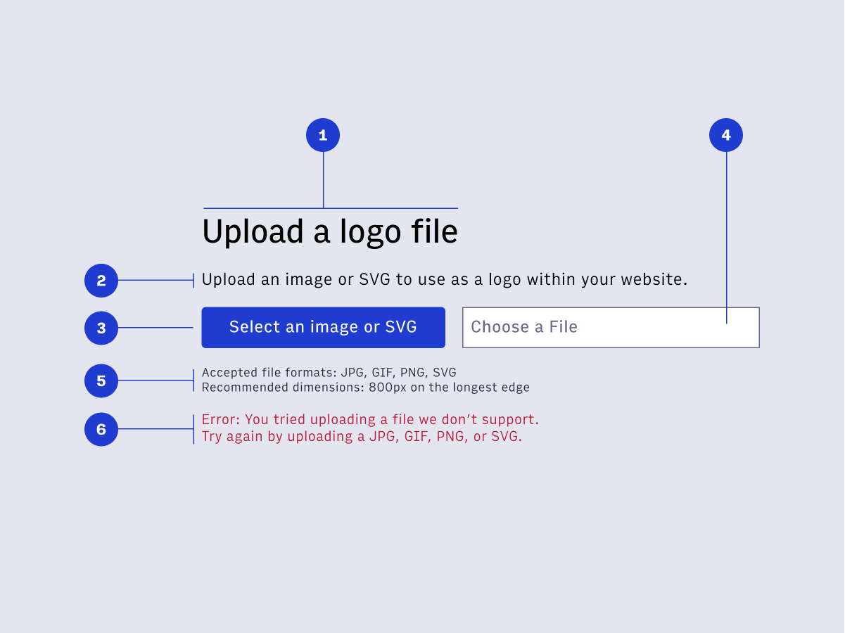
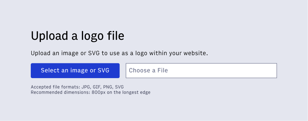
- Contextual headline - Help the user by giving the file upload a helpful title. What are they uploading?
- Description - A short description that provides more context. What is the user uploading, and how will it be used?
- Select button - A button of any state/size that says in the button text the type of file accepted.
- Input field (optional) - Once the user has made a file selection, this input field will display that filename. This is applicable when the upload is not instant, and the user must complete an additional action to upload.
- Helper text - Helper text creates clarity by communicating what the system is expecting. This should include the various types of files (JPG, GIF, PNG, SVG), as well as any other important considerations (recommend dimensions, et al.)
- Error text - This text displays when there is an error. Always try and display unique error codes for every type of error. This should be useful to the user, reminding them of what the system is expecting so their next attempt is successful.
- Wrap the upload button in a
<label for="fileupload"></label>
- Wrap the button text in a
<span role="button" aria-controls="filename"></span>
- For the optional input field that displays the filename use
<input type="text" id="filename" autocomplete="off" readonly placeholder="choose a file">
Copyright 2021 Arc XP
 Arc Design System