Drag and drop
Users often need controls to reorder items within a group. Drag & drop functionality is a common pattern and is a solution to this challenge. The overall experience should be intuitive, provide visual feedback, and above all be accurate.
 When used effectively, drag & drop delights users by effectively communicating:
- Which elements within an interface can be dragged
- Where the interface anticipates a dragged element will be placed
- Where the dragged element ended up within the group
Drag & drop is a useful pattern when:
- A user must create or update an order within a group of items
- Visually constructing content. Examples:
- Moving images within a gallery
- Moving blocks within a PageBuilder Editor layout area
- Moving content elements within Composer
- Moving content within a WebSked Collection
Arc Design System components that have drag & drop capabilities use this library.
https://github.com/atlassian/react-beautiful-dnd
https://docs.dndkit.com/
The following design considerations should be implemented when using a drag & drop pattern.
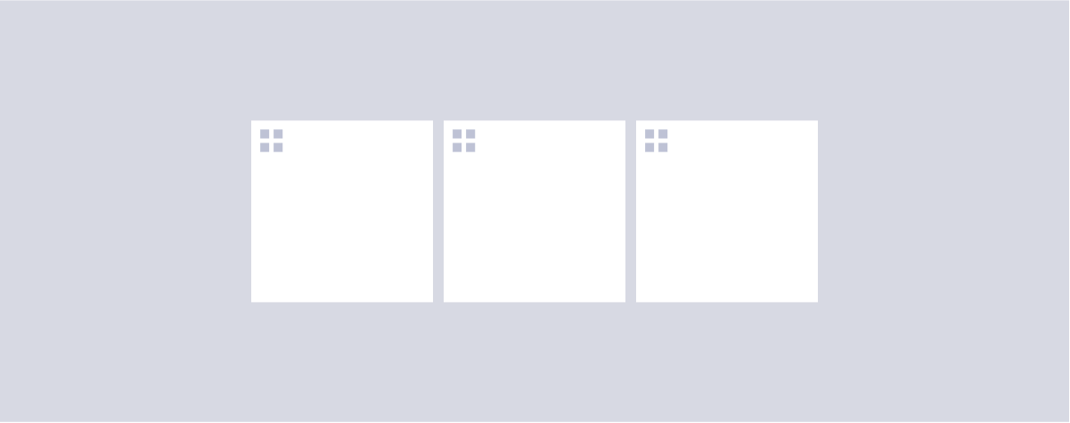
 Items that can be dragged have the standard visual indicator.
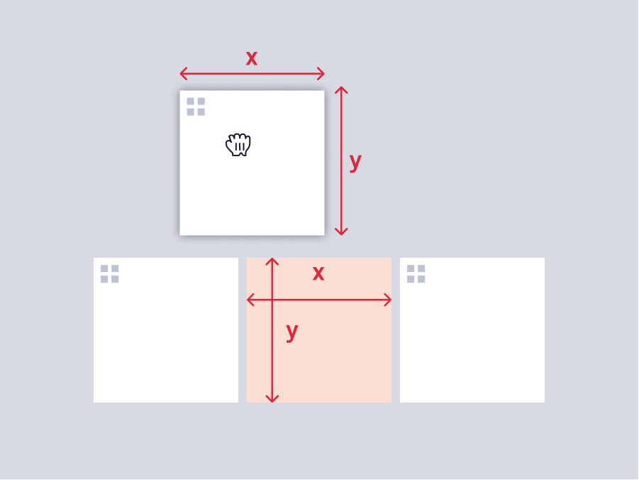
 For items that can be dragged, hit zones are an important consideration. The hit zones for the draggable items depends on what is inside the item itself. If the item contains links, IconButtons, or other UI elements that have hover/click interactions, then the hit zone for drag should be contained to give room for other features.
In the examples in the image above, the hit zones are denoted in red. When the user clicks and drags anywhere in that area, it will start the drag & drop. The hover cursor should also change to the grab cursor when the user enters the hit zone (red areas in the above example).
For items that can be dragged, hit zones are an important consideration. The hit zones for the draggable items depends on what is inside the item itself. If the item contains links, IconButtons, or other UI elements that have hover/click interactions, then the hit zone for drag should be contained to give room for other features.
In the examples in the image above, the hit zones are denoted in red. When the user clicks and drags anywhere in that area, it will start the drag & drop. The hover cursor should also change to the grab cursor when the user enters the hit zone (red areas in the above example).
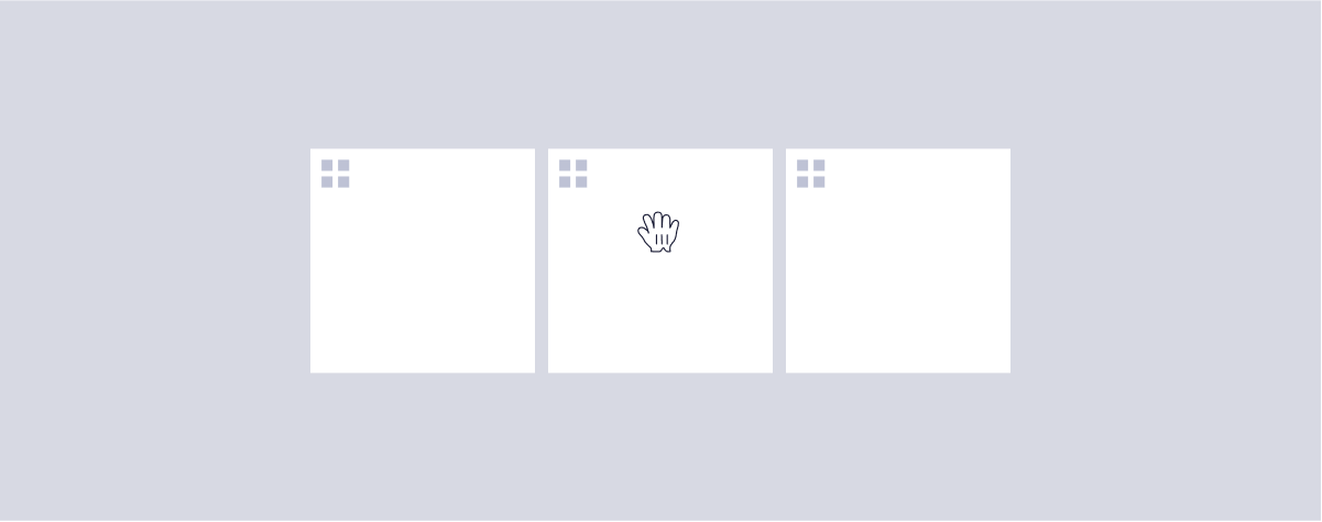 When a user enters into a drag hit zone, the cursor should change to hint to the drag functionality. Items that can be dragged have a special cursor css on hover.
cursor: move;
cursor: grab;
cursor: -moz-grab;
cursor: -webkit-grab;
In some instances, the entire item may have this hover, and in other instances it may be appropriate to only have this hover style on the visual indicator itself.
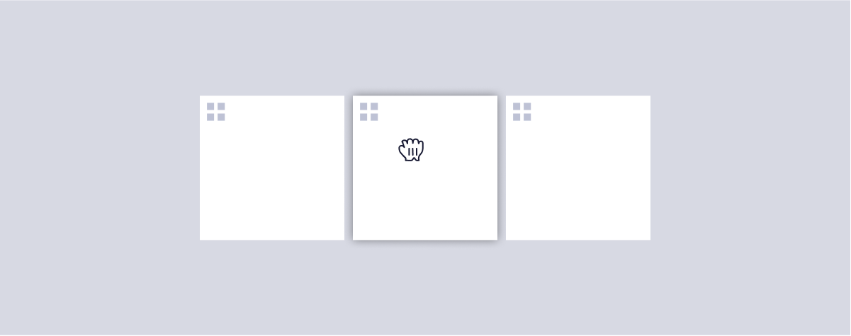 When dragging an element, the item should receive $elevation400 and a special css cursor:
cursor: grabbing;
cursor: -moz-grabbing;
cursor: -webkit-grabbing;
 The front-end takes the size of the dragged element, and uses those dimensions to create a natural space the item can fit inside of.
#Accessibility considerations
 Arc Design System