Links
Links are basic interactive patterns which allow a user to move from one view to another. Links come in two flavors; inline as part of a body of text, and free floating ‘block’ links which exist as their own element. This is in contrast to buttons which are used primarily for specific, non-navigation actions.
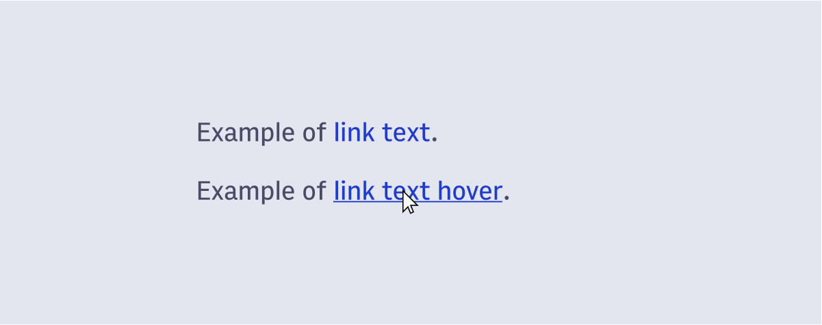
Links derive most of their typography styles from the Typography System used in the Arc Design System. They are given a different color and an underline to help users identify them as interactive page elements. The only styles which aren’t inherited from the general typography of the Arc Design System follow:
Color: Blue600
Text Decoration: underlined
Links tend to have a lower prominence than buttons do on the page. Font size should be considered to ensure that they don’t seem subordinate to buttons on the same page, or in the same component if this isn’t the case.
As long as links are used with best practices for inclusivity they need little additional support to be interpreted by assistive technologies.
- Enter key to trigger link.
- Keyboard should support hover and focus states.
- If a link opens a new browser tab or window that must be indicated by supporting text.
- We may need to consider how to warn non-sighted users that a modal will appear on button click [TBD].
Copyright 2021 Arc XP
 Arc Design System