| No data empty states |
First time use, no data added yet |
User understands why there is no available data and what will be available on the page when data has been added or is available. They understand how data gets added. |
When data has not been added and to give the user context of why it has not been added. |
| Onboarding/starter content empty state |
First time use |
Starting from an empty state, provide users with the ability to contextually onboard, and gain deeper understanding of the product, by prompting them to take action. |
When introducing a feature or action that may require more detailed explanation of concepts, a step-through of a workflow sequence, or other information that enhances productivity. |
|
|
|
|
| User action empty state |
No results when searching |
User understands how to adjust search terms or filters to optimize their query. |
To provide the user with feedback that there are no results for their search query. |
| Error management empty state |
Permissions or systems issue. |
User understands the problem and, if there are corrective actions available, knows what action to take or has options to correct the issue. |
When something is amiss or some level of intervention or troubleshooting is required, a higher level of detail and specificity will better support the user. |

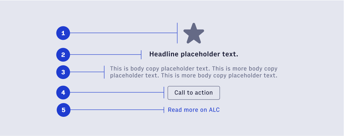
 Within the basic empty state the text tagline and icon are required, while the title, call-to-action button and link are optional.