 Arc Design System
 Arc-UI 1.2.0
An overview of what's included in 1.2.0 release of the Arc Design System
#React Components:
#Dialog
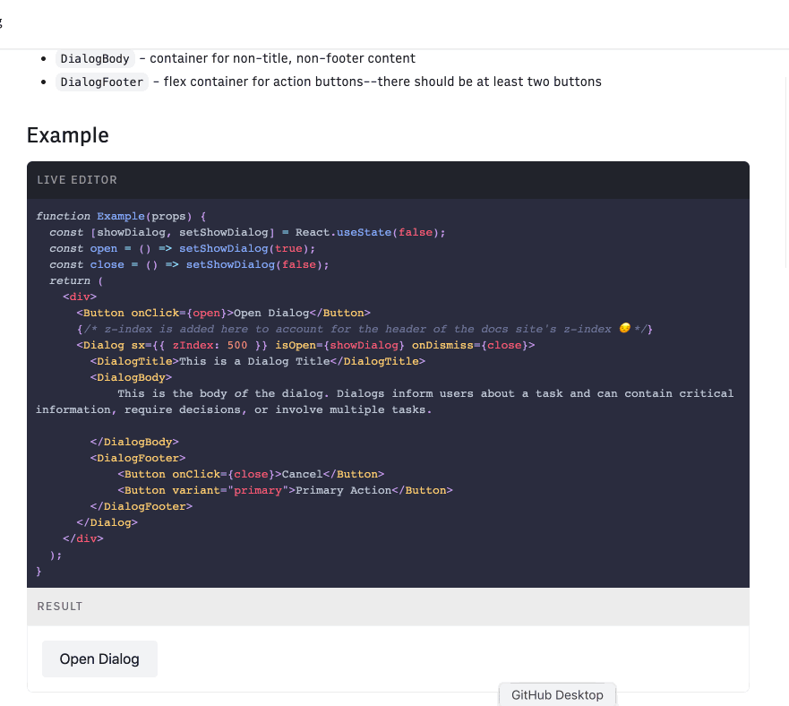
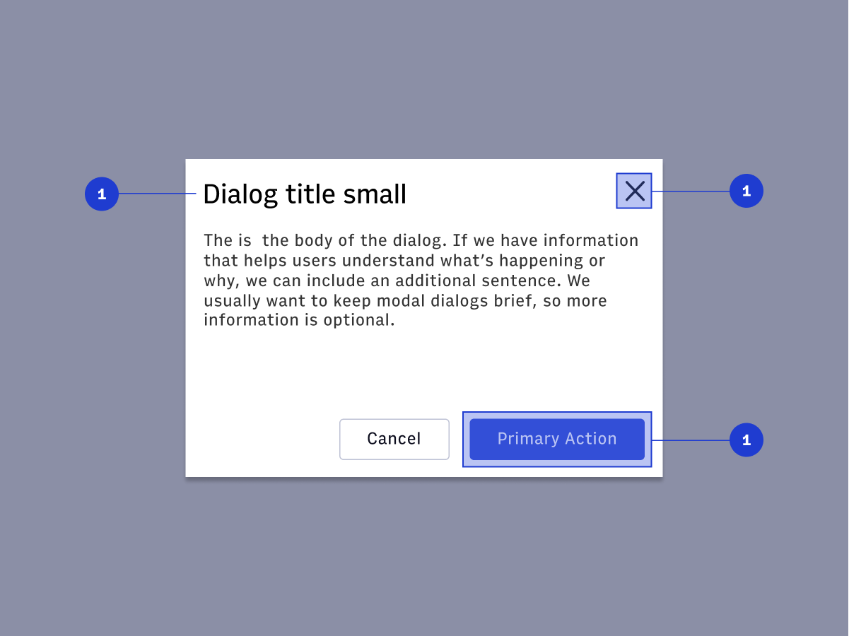
Dialog, DialogTitle , DialogBody , DialogFooter.
#Icon
#Design Documentation:
#Icons
#Pagination

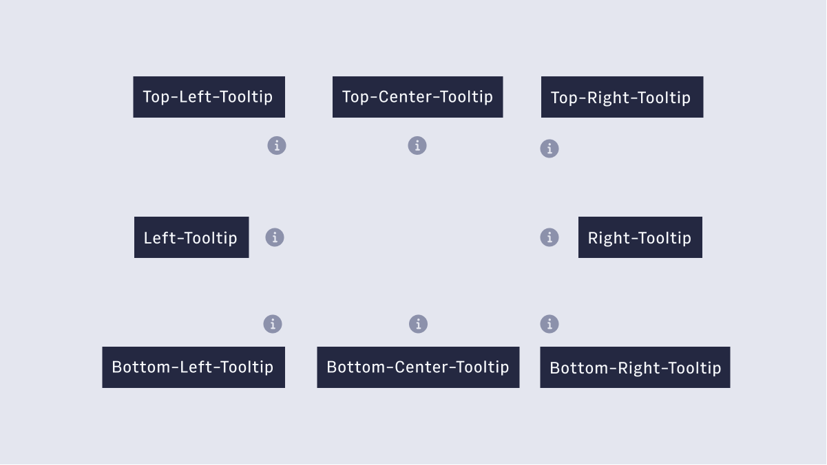
#Tooltips
#Dialog
Questions? Reach out on #ads-support on slack.
Back to release notes