Arc-UI 1.4.0
#React Components
- Updated
AlertAction-@wpmedia/ads-notification@0.2.0 - Updated
Icons-@wpmedia/ads-icon@0.1.1 - UpdatedSCSS and Bootstrap variables
@wpmedia/ads-theme@1.3.0
#Guidelines
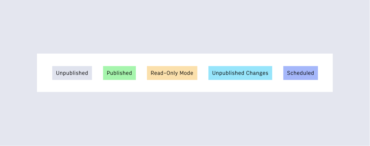
- AddedBadges
- AddedFile Upload
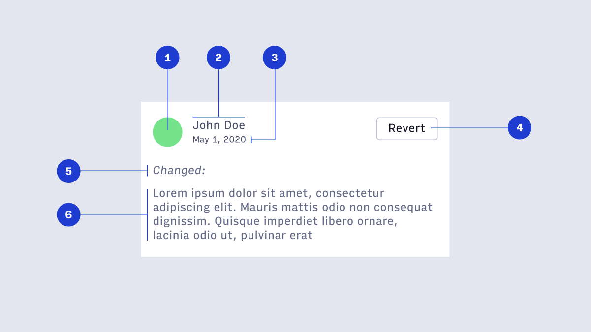
- AddedRevision History
- UpdatedForm Validation
- UpdatedToggle
#React Components
preventClose prop on AlertAction.
New - We have added 18 paths for use within our Icon react component. You can now also view the full icon library via a Figma embed in the documentation.
#Design Guidelines
- Unpublished - content is new and has not been published.
- Published - content is published and live.
- Read-Only Mode - another user is currently editing content
- Unpublished Changes - changes have been made that are not yet published.
- Scheduled - content is scheduled for publish.

New - In Arc XP, our users upload files in many places. This pattern creates an experience that reduces upload friction and errors, by clearly communicating what our system is expecting.

New - Throughout Arc XP users create, revise, and publish content. The collaboration during the authoring process requires a robust system for displaying and accessing revision history.

Updated - All required fields should be indicated via (required) tag in the label.
Updated - The toggle color was changed from
$arc-green-500: #1f3cd0; to $arc-purple-500: #1f3cd0.
#What are we working on now?
- Publish / Work Bar
- Arc Navigation 2.0
- React components for all atomic elements
- Small Variants of Form Elements
- Website Selection
- More layout primitives like Stack and Grid
#Arc Design System in Action
- Theme Builder / Theme Settings
- Photo Center Image Landing Page
- Global Settings - Distributors
Questions? Reach out on #ads-support on Slack.
Back to release notes