 Arc Design System
 Arc-UI 1.5.0
This release brings more infrastructure changes, new React components, and several new design patterns. This release also includes several updates to existing components and patterns.
#React Components
- AddedIconButton
- AddedStack
- AddedFrame
- AddedPage
- AddedSidebar
#Design
- AddedWork Bar
- AddedSmall form fields
- AddedSkeleton pages
- AddedCard
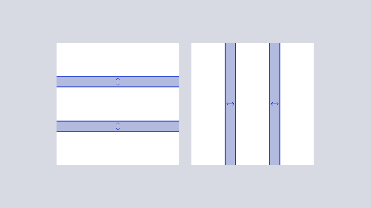
- UpdatedSpacing scale
- UpdatedType scale
#Infrastructure updates
#Moving to GitHub Packages
#Beta Releases
@beta tag and represent the current state of the dev branch in the WPMedia/arc-ui repository.
E.g.,
npm install @wpmedia/ads-button@beta
#React Components
 Page layouts simplify the process of creating overall page layouts that standardize size and spacing as well as account for the ArcNav and sidebars.
This release adds three page layout components:
Page layouts simplify the process of creating overall page layouts that standardize size and spacing as well as account for the ArcNav and sidebars.
This release adds three page layout components:
- Frame - top level page layout plus ArcNav
- Page - spacing to account for page body and sidebar
- Sidebar - fixed width container that can optionally be included with
Page
#Design

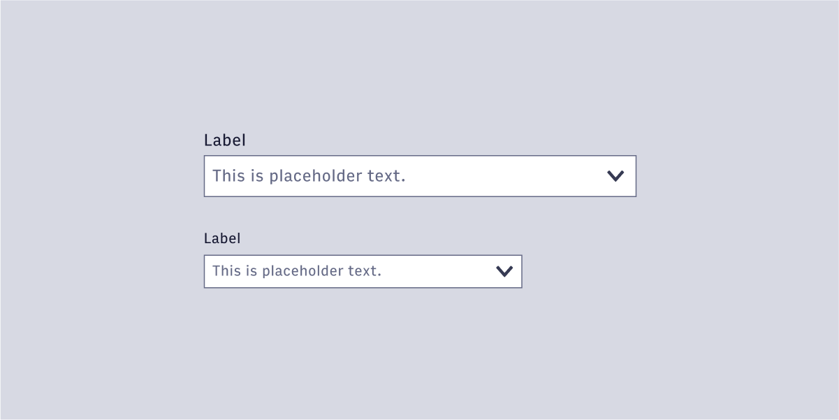
Small variants have been added to several form field components.
Skeleton pages are a useful pattern for pages where there is a lot of content that may be slow to load. The goals of a skeleton page are to hold the layout, while communicating to the user that content is being fetched and loaded.

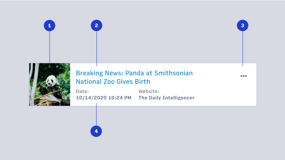
Cards group related information in a flexible-size container. Cards often provide an entry point to further details on their subject.
#What are we working on now?
- Work Bar React component
- Arc Navigation 2.0
- Arc integration components (Image Search)
- Single select React component
- Website selection / presentation of selected websites
- Checkbox and radio button React components
Questions? Reach out on #ads-support on Slack.
Back to release notes